There’s a fascinating discussion around technical interviews recently; would both candidate experience and hiring signal be improved by revising the current round of (basically Google-inspired) non-runnable algorithm-centric coding examples completed under time pressure?
I’ve been following Thomas Ptacek’s tweets about it for a few months, for example:
“We could have you write and test code like a normal person, but instead we interview you based on something utterly unlike coding”.
We’ve put a great deal of effort into designing our interview process so that it is comprehensive and consistent, and are working hard to remove as many points of bias as possible. To date we’ve found it successfully identifies people who will succeed here — those with a high degree of technical competence who also embody Slack’s values: empathy, courtesy, craftsmanship, solidarity, playfulness, and thriving[…]
We’d like to get an idea of how you write code in the real world, since we feel this is the best indicator of how you’d write code day to day here at Slack. Granted, the Slack codebase is larger and more complicated than any technical exercise, but we have found the technical exercise to be a good indicator of future performance on the job. There are great engineers at big name companies and at small ones, so this gives everyone a chance to shine independent of where they are now.
This varies by position, but generally you’ll have a week to complete a technical exercise and submit the code and working solution back to us.
Uncritical praise of take home exams started to ring alarm bells for me. I recall take home exams from university; one of my majors was philosophy, which tended to assign a long essay (eg, 4000 words) to be completed over 6 weeks or so, and a take-home exam (eg, 2 essays of 1000–2000 words) to be completed with a four day deadline. I moved out of a rural town to go to university and lived on my own. From age 19, I also financially supported myself. I loathed take home exams, because I was competing with people who would get the exam, go home, and work on it all week in the house they lived in with their parents. No job. No housework. (Admittedly, no self-imposed decision to take 125% of a normal course load every year for four years of university either, that one was on me.)
And that was before I had two children. I’m not at all excited about tech interviews moving to a model where I’m doing a huge amount of work in my own time, because I do not have a huge amount of free time. Anecdotally, I have already heard of people spending in excess of 20 hours on Slack’s coding exercise. Freeing 20 hours in a week is a non-starter for me, especially if I’m not a clear finalist for the job. Slack is administering these take home assignments prior to on-site interviews, and is a very sought after workplace; it’s quite possible their process will be widely copied and people will regularly be doing a couple of days of coding before in-person interviews, for many many jobs.
To be fair, I have also read through Steve Yegge’s Get that job at Google and estimate that, at my current levels of free time, it would probably take me a couple of years to complete the preparation he recommends. (I have an undergraduate degree in computer science and mathematics — the philosophy major was a separate degree — and a PhD in computing, but at this distance I am far from passing an exam in discrete maths.) But I also wouldn’t be required to submit work samples proving I’d spent that time.
I am also aware that other positions require extensive preparatory work for job interviews for senior candidates, such as preparing sample budgets or strategy presentations or similar, but it’s at least more common only to give such large amounts of work to later-stage candidates for the position.
Let’s not get uncritically excited about adding (yet another!) screen for “isn’t a mother of young children”. I am thrilled that Camille Fournier has made several similar points in Thoughts on Take Home Interviews (also available on her blog):
On twitter, a discussion ensued about whether asking people to spend time at home doing exercises didn’t itself cause bias, against those who did not have a lot of spare time to be doing take-home exercises. Julia mentioned that they expect it to take 2–4 hours, but admitted that some people got really into the project and spent far longer than that[…]
The creative take-home also seems likely to select for those with free time, because if it is really an exercise that some people want to overdo, they will overdo it and you will have a hard time not rewarding that enthusiasm (why shouldn’t you!). And while it’s ok to ask for a few hours, building something that rewards those who can spend far longer is likely to bias against those who have, say, kids to take care of after work and on weekends, or other activities that limit their free time.
If this thing catches on, then it’s going to become a gating mechanism for every developer job in existence. New grads will be faced with hundreds of hours of “take-home” work that goes into the same black hole as their resumés.
Also worth a read: Rod Begbie gives a postmortem of a take-home interview question he used to administer.
I’m excited about revising the technical interviewing process, which will require both experimentation and evidence. While experimenting, and as the tech industry actively seeks candidates from under-represented backgrounds, the ability of candidates to interview with your organisation without tens of hours of free time for take-homes in addition to time for on-site interviews should be a core design principle for your interview process.
Leigh advises if you tell a story three times, blog it. My version is “if you give advice three times…” I tend to assume that Sydney advice is fairly easy to find for visitors, but sometimes it’s better from someone you know! I’ve given advice to three separate first-time travellers to Sydney in two months, and am accordingly freeing it for you, my reading audience.
What sort of advice is this anyway?
I’ve lived in Sydney for 17 years this year, my entire adult life. My Sydney biases: I like walking and exploring ourdoors. I like things that can be done during the day and ideally that you can take children to. I like dining out including fine dining. I’ve spent the vast bulk of my time in Sydney living without a car and tend to recommend things accessible via public transport.

There are some things I can’t help you with: I’ve never spent much time in pubs and clubs and in any case I’ve had children for more than six years so my already limited partying knowledge is pretty well atrophied now. I’m also not a serious outdoor sports person: I know you can kayak and ocean swim in Sydney but I can’t tell you where or how better than the Internet can.
Where to stay
Unless you have some reason to stay in some particular part of Sydney, stay near Circular Quay or Wynyard train stations for access to the most public transport. If you’re visiting almost entirely for the beaches, stay in Bondi or Manly.
What to do
Walk from Circular Quay past (or into) the Opera House and through the Botanical Gardens. The Opera House has performances in many genres if opera isn’t your thing.
Catch the ferry from Circular Quay to Manly. The ferry trip alone is worth it; it is one of the longer ones and you will see much of the eastern harbour. Manly is a beach suburb; you can swim at a harbour or ocean or sheltered ocean beach, do the Manly to Fairlight penguin walk or go to the aquarium.
Catch the ferry from Circular Quay to Cockatoo Island. Cockatoo Island used to be a island-sized shipyard and is now an island-sized museum of ex-shipyarding. You can ramble through giant sheds and along catwalks and so on. There’s on-island camping and glamping, the only harbour island that allows overnight stays. If an island picnic is more your thing, there are also private ferries from Circular Quay to Shark Island, which is more like a large park.
Visit the Maritime Museum at Darling Harbour. Their permanent exhibits include decommissioned naval vessels and a submarine. Have a look at the current exhibits at the Powerhouse Museum for science and technology possibilities.
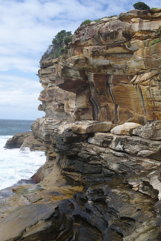
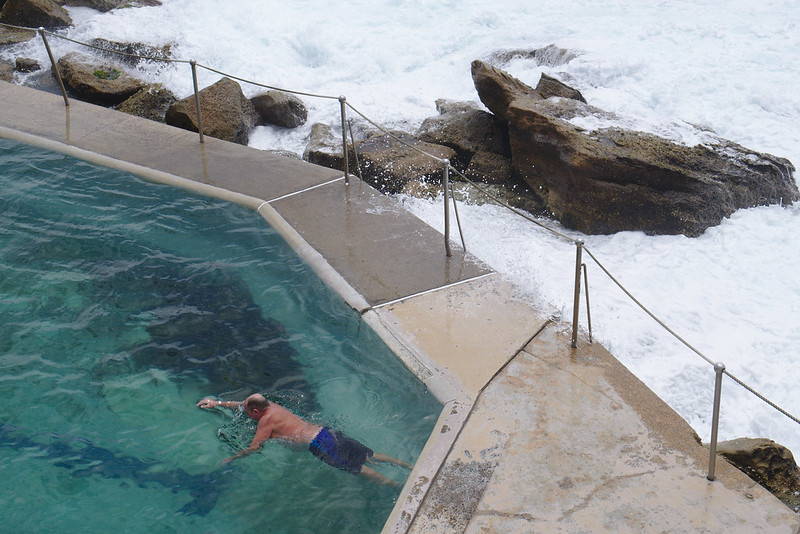
Head to the beach. As above, Manly is a good choice, and in the eastern suburbs Bondi is famous and has fairly good transport. It’s also a starting point for the beautiful Bondi to Bronte coastal walk. Coogee is the beach with perhaps the next best transport options. Clovelly is a long inlet and thus very calm. Most beaches, including Bondi, Coogee, and Manly have an ocean bath – a pool filled with seawater – if you’re not up for swimming in the ocean.
The art gallery I like best is the Museum of Contemporary Art right at Circular Quay. The huge mural at the entrance is re-commissioned and painted over once a year or so, so look at the current one whenever you go. The cafe at the top has an excellent view.
I’m not done with ferries yet, you can also catch Circular Quay ferries to Luna Park, a harbourside amusement park, and to Taronga Zoo, Sydney’s best known zoo. The Gunner’s Barracks in the vicinity of the zoo is a great ramble but harder to reach from the south side of the harbour.
Great walks include the Bondi to Bronte walk mentioned above, the Glebe foreshore walk and the Harbour Bridge to Manly walk (or the Spit Bridge to Manly half depending on your walking distance and available time).
The water park Wet n Wild may be more of an acquired taste, but I keep wanting to take visitors there. You don’t need to be an especially strong swimmer but a love of rollercoasters might help.
Seasonal things to look out for include the yearly Sydney Festival and Vivid festivals in summer and winter respectively. Vivid includes large light installations around the harbour and other parts of the city. There’s Sculpture By the Sea exhibits on the Bondi to Bronte walk in spring. The film festival is in June and the comedy festival in April and May.
Where to eat
Fine dining is often in flux, check recent restaurant reviews. The Boathouse at Glebe is the closest to a regular we have; it specialises in seafood. Cafe Sydney is my preferred place with a view.
For cafes and gastro pub-style eating, head to Surry Hills; bills is the best known cafe. Haymarket is the centre of Chinese food, and the other side of George Street has some great Thai places including Chat Thai.
If despite my protestations of ignorance someone insisted I choose the bar, for visitors I’d go with the Opera Bar on the lower level of the approach to the Opera House, or try out Blu Bar at the top of the Shangri-La if everyone was willing to primp for it. If your motivation is cocktails alone, the Different Drummer in Glebe is good.
Out of town
The Blue Mountains to the west are reachable as a day trip on public transport; head to Katoomba and to the Echo Point lookout.
Jervis Bay to the south is a good weekend away; you’ll likely want to drive. If you want to do some kayaking without having to deal with the boat traffic in Sydney Harbour this and several other places on the coast are good alternatives.
Luna Park Sydney by Simon Clancy, cropped and colour adjusted by Mary Gardiner.
Vivid Sydney 2014 by MD111, rotated cropped and colour adjusted by Mary Gardiner, availabe as Creative Commons Attribution-Sharealike. The Museum of Contemporary Art light show in 2014 was inspired by artist Jess Johnson, but artist unknown and copyright presumably all rights reserved.
Select the domain you want from the dropdown, check the box next to ‘By checking this option you agree to the Let’s Encrypt Terms of Service.’, leave ‘Unique IP’ unchecked, and press ‘Add now’.
Important: wait for an email from Dreamhost telling you the certificate is ready. This seems to take about fifteen minutes or so. The email contains a copy of the certificate but you don’t need to do anything with it, they configure the webserver automatically at about the same time as they send the email.
Once you have received the email, check that your site is available at https://YOUR-URL and that your browswer does not report errors. (If it does, wait around 15 minutes, try again, and if you’re still seeing errors, screenshot them and contact Dreamhost support.)
Now that HTTPS is working on your site, you can then force all HTTP requests to redirect to HTTPS by placing this in the ~/YOUR-URL/.htaccess file:
# tell web browsers not to even try HTTP on this domain for the next year
# uncomment this only after you've confirmed your site is working on HTTPS, since it commits you to providing it over HTTPS
# Header set Strict-Transport-Security "max-age=31536000" env=HTTPS
Check that visiting http://YOUR-URL now redirects to https://YOUR-URL, and the same should be true of pages underneath http://YOUR-URL.
Feature request for Dreamhost: make a “force HTTPS” option in your standard config.
If your site is a bunch of static HTML files, and you have done a lot of absolute linking to your own webpages, here’s a possible command you could run, replacing example.com with your own domain. I don’t recommend running it unless you know the UNIX command line, and you have a fairly good idea of what find and sed both do:
DOMAIN=example.com
cp -a ~/$DOMAIN ~/$DOMAIN-backup-before-https-edit
cd ~/$DOMAIN
find -type f -name "*.html" -exec sed -i "s/http:\/\/$DOMAIN/https:\/\/$DOMAIN/g" {} \;
The year. Otherwise your event for the 18th April might be in a few weeks, or it may be a stale webpage from your very successful and very over event in 2004.
The weekday. Otherwise I can’t intersect your event’s day and my (ridiculously complicated) personal calendar in my head and figure out if this is a Tuesday probably-I-could-swing-it event or a Wednesday nope-I’ll-be-in-Melbourne event without authenticating to some device and opening my calendar navigating to the day and… SQUIRREL.
If you are kind-hearted, you could add a few of very very many pieces of information suggested in the AdaCamp template lovingly brought to you by seven revisions of AdaCamps. But you can start off with the year and weekday.
Welcome! This post is the 92nd monthly Down Under Feminists Carnival. This edition of the carnival gathers together December 2015 writing of feminist interest by writers living in Australia and New Zealand. Thanks to all the writers and submitters for making this carnival enraging, sorrowful, celebratory, and joyous in different ways and at different times.
Highlighted new(er) Down Under voices
I’ve highlighted posts that come from people who began been writing at their current home in 2015, such posts are marked with (new in 2015) after the link.
The inquest into the August 2014 death of Ms Dhu in custody in continued in early December (now to resume in March). December writing about Ms Dhu’s death and the inquest included:
We stuck with the Logitech Squeezebox system for streaming home audio long long past discovering that Logitech was ending development of the ecosystem but inevitably it started to date. Our Squeezebox Classic didn’t survive our house move in May. Our Squeezebox Boom and Squeezebox Radio did, but over the last year Andrew subscribed to Google Play Music, I switched to a podcasting app (Pocket Casts) for my phone rather than a command line tool that downloaded new episodes (podget), and so more and more things became phone-only and unable to easily send audio to the Squeezeboxen.
We like whole-home audio (the ability to play the same thing throughout the house), so even aside from audio quality issues, Bluetooth wasn’t going to cut it. I started to look into switching to the Sonos system, but it was another all-in system where we’d be looking at replacing all of our equipment if Sonos went out of business or end-of-lifed their setup. Logitech, you’ve done a number on the hardware side of whole-home audio systems. So we’ve switched to using good speakers with fairly cheap and disposable ecosystem adaptors, ie, the Chromecast Audio.
Software:
ReadyMedia (formerly MiniDLNA), which we were already using to stream video to the TV, let’s us continue having access to the audio on our Ubuntu home server
BubbleUPnP to send audio from the home server to the Chromecasts
ReadyMedia has to be one of the easiest to configure Linux services I’ve ever dealt with. I’m intending to play around with BubbleUPnP Server in front of ReadyMedia shortly; shared playlists are still a Squeezebox feature missing from this setup so far.
We also needed speakers to replace the Boom and Radio (we could have used their line in function, but we’ll sell them to continuing Squeezebox users). Thus, new equipment to go with the set of Yamaha MSP5 powered speakers we already have:
The mixer is something of a revelation: we’re feeding the TV audio and a Chromecast into it, in order to be able to listen to either of them through the Yamaha speakers without having to press any buttons or even use any kind of remote. Obviously we pretty much never want to listen to the TV and the Chromecast outputs simultaneously; but we can now listen to them in very rapid succession and the energy needed to decide to listen to music in the lounge room is way way lower than it was. Long may the Hamilton cast recording, Justice Crew’s Que Sera, and Doctor Who podcasts be heard around our house.
Graphics have been spicing up my writing and slidedecks over my fifteen years as a writer and a public speaker; the simpler and more attractive the better. But it’s not easy to put them there.
I’ve had the good fortune to also have been an amateur photographer the whole time, and have taught myself some basic image editing skills, so when I find an image that’s not quite right but could be, I pop it in an image editor, twiddle a reliable and small set of dials, and out emerges something more eye-catching. Lucky me. And lucky you: the tricks to turn a photo into something simpler and more eye-catching are simple, and today is the day I share my version of them.
Are you a wordsmith more than an visual person? Are you a writer or a public speaker who appreciates the power of a strong visual in other people’s pieces and slide decks, and wish you could just twiddle a few dials and make it happen with your own images? Do you want to make featured images for a WordPress theme, or something to break up a millionty paragraphs of text, or a colourful image to re-engage your audience in your talk? Do you sometimes have an idea of what you want but the images your searches dig up are just a bit flat for your purposes? This is for you.
This entry covers two topics: first, finding existing images that you can make work for you without any further editing. Win! And the next level: when you have an idea of what you want, and you have a photo that… doesn’t quite tell that story… but could… it’s time to make some quick and dirty edits to liven it up. Make the colours a little stronger or stranger, eliminate some clutter, and pull out some detail. Your illustrations are complete!
Eye-catching photos for wordsmiths: principles
Eye-catching images accompanying to your writing or speaking should be brain candy: simple subjects that people can identify at a glance; high contrast so that most people can understand what they’re seen quickly; and understand at a glance; and brightly or interestingly coloured because it’s eye-catching and fun. Your illustrations will usually be a subtlety-free zone.
Luckily simple, colourful, and easy to understand is an appealing set of things to have in a photo, so you’ll often be able to find free photos that you can use without editing. But there’s also a very simple set of tools that will let you take an existing photo and up its simplicity and eye-catching for your work. Finding first; then failing that, editing.
Finding images
Use photos that the photographer allows to be used and changed by other people! The Creative Commons system provides photographers and others with a way to give you this right.
To find images with Creative Commons licences that match my needs, I head on over to Flickr search, with Commercial use & mods allowed selected in the “Any licence” drop down. A couple of Flickr search tips:
search for generic terms. If you’re looking to make a point about time, first search for “clock” and “watch” and “sundial”, not things like “clock showing noon” or “bedside clock”. Images are often fairly generically labelled by their creator and you miss some good stuff by going specific.
use Flickr’s “Interesting” search tool. There’s a dropdown labelled “Relevant” — by default Flickr is trying to find images whose textual description and tags best match your search term. Try changing it to “Interesting”, to instead find somewhat matching images that are very popular on Flickr. This will often bias towards images that are already technically good, highly saturated, have an unusual subject or setting, and similar; exactly the kind of eye-catching things you want for your blog post or slide deck.
Flickr isn’t the only Creative Commons game in town: there’s also Wikimedia Commons or Google Images (after your search, go to “Search tools”, then “Usage rights” then “Labeled for reuse with modification”.
Caution: often images found this way must still be credited to their creator. Learn more here. Caution: be careful of images with recognisable people in them. The permission you got to use the image was from the photographer, not the subject. Ethically, the person in the photo may not wish to have their likeness appear with your content, and in some cases using images of people may be restricted by personality rights or privacy rights. It’s usually best to skip images of people, or to buy them from a reputable stock image site.
The point of this tutorial is to make adjustments to some of the most common “knobs” you can twiddle on digital images. If you want to start making edits, and you already have a tool in mind, look up how to crop, how to auto adjust levels, how to change saturation, how to change contrast, and how to change brightness in your chosen graphics software.
In this tutorial, I’ve made the edits to images with Pinta, a free and comparatively simple graphics program for Windows, Mac, and Linux. I haven’t used them, but Paint.NET is a widely recommended equivalently straightforward Windows image editor, and Pixelmator seems highly recommended on Mac.
Editing photos to be eyecatching: short version
crop the image so that the subject of interest comprises most of the image, and is off-center
try auto-level colour adjustments
try somewhat increasing one or more of contrast and saturation, perhaps while twiddling brightness up or down
also try decreasing saturation
That’s it! If you want examples of what this looks like in action, read on!
Editing photos to be eyecatching: with examples
Meet our original images
Old Computer by Sean MacEntee. Old Computer is a surprisingly rare beast: a freely licenced photo of a computer that is being discarded. I find it easy to find great photos for search terms like apple or pen, less so for “computer in trash”. It’s a problem when you write complaints about computers a lot.
Old Computer has two major limitations if you wanted it for your condemnation of the tech industry or your rage at discarding electronics into landfill:
it’s “flat” colour-wise: there’s a lot of very similar beige-y colours in the image
there’s a lot of classroom in the shot and not a lot of computer-in-bin
PC270246 by NickDun (hereafter called SCUBA). This is a very evocative shot of what scuba diving in a group is like and would be a great addition to your story of getting your mask kicked off by that so-and-so who probably certified yesterday, but:
it’s a very typical shot taken with an underwater camera, that is, it’s extremely blue-tinted
there’s a lot going on in it; if you want to talk about sunlight and freedom, or if you want to talk about crowds of divers, you may only want to illustrate your post with part of the image
Big Rubbish Project: Eden Project 2011 by University of Exeter (hereafter called Big Rubbish). What can I say? Garbage is a versatile metaphor and images of garbage are useful. This image is visually striking: there’s lots of repetition and patterns, and not a lot of extraneous clutter in the surrounding scene. But it also has rather dim, flat colours.
Step 1: crop
Old Computer has an issue with a lot of surrounding space; and SCUBA has two separate things going on in it. This we are going to fix by cropping the image. Cropping means cutting out some of the photo. Where possible, you want to cut out other unrelated objects, and large expanses of foreground and background.
Cropping principle: have the object of interest filling most of the photo, slightly off center.
In Pinta, select the Rectangle Select tool, drag to draw a rectangle over the bits of the image you want to keep, and then go to the Image menu and select Crop to Selection.
Old Computer, cropped so that the computer and the bin occupy much more of the image:
And two crops of SCUBA, the first showing the divers snorkelling at the top of the image and the second showing the divers grouped at the bottom:
Honestly I’m a bit sad to crop SCUBA, because the full image is so evocative of the last two or three minutes of SCUBA dives. Let this serve as a lesson: none of this editing is compulsory. Sometimes let less be more.
I’m even more loath to crop Big Rubbish, since as I noted at in its introduction I quite like its current framing. But one possibility with cropped is to change the message of the picture a little. For example, here’s a crop that implies that the extent of the garbage could be much larger:
An even tighter crop, taking out the edges on the bottom and right could imply that it wasn’t well contained.
Having made that illustrative crop, I’ll go back to working with the full version of Big Rubbish in future steps.
Further reading:Rule of Thirds for a guideline on centering or not centering your object of interest.
Step 2: auto level
At the start, we saw that all of Old Computer, SCUBA, and Big Rubbish have “flat colours”. “Auto level” commands are the simplest way to get a good variety of colour levels to diminish this effect.
In Pinta, go to the Adjustments menu, and select Auto Level.
The effect on Big Rubbish is most dramatic and most of an improvement for eye-catching purposes (original on left, auto-levelled on right):
Contrary to (my) expectations, the effect on Old Computer is extremely subtle (original on left, auto-level on right):
But don’t worry, we’re not stopping here with jazzing up Old Computer.
The effect on the two SCUBA shots is dramatic, as it often is with underwater shots. Here’s the top one (original image at top, auto-level at bottom):
You’ll notice that while the range of colours in the auto-levelled picture is wider, it has not ended up looking especially realistic. Realistic high-fidelity underwater photographs are not easy to produce… but luckily realistic is not our goal here; our goal is striking.
Sadly, the bottom crop of SCUBA is pushing the limits of colour adjustment: if there’s really only blue in the picture, auto-level will find red where-ever it can, no matter how ill-advised (original image at top, auto-level at bottom):
Not so great. But give auto-levelling a go with any picture you are trying to edit; there’s always an Undo command.
Step 3: increase contrast and saturation
Increasing contrast increases the distinctness of the colours in the image (beyond auto-level); and increasing saturation increases their richness.
In Pinta, go to the Adjustments menu, and choose “Brightness / Contrast” for a contrast slider, and “Hue / Saturation” for a saturation slider.
Here’s Old Computer, with the Saturation slider (which starts at 100) increased to 150, and the Contrast slider (which starts at 0) increased to 30 (auto-levelled version on left, higher contrast and saturation version on right):
And here’s Big Rubbish, with three adjustments. I took Saturation to 130, contrast up to 20, and brightness down to -50 (auto-levelled version on left, higher contrast, higher saturation version, and lower brightness version on right):
Since I’ve made it darker again, and thus more like the original, let’s keep ourselves honest and compare with the original too (original on left, auto-levelled with lower brightness, higher contrast, and higher saturation version on right):
Our version has a lot more red: the bottles are white rather than blue, and the rusty bin has a warm red tone (partly due to auto-levelling and partly due to increasing the saturation dramatically). So auto-levelling and messing with the colours paid off even though I went and reduced the brightness back down to close to the original.
Saturation is a very powerful slider: make your colours richer by increasing saturation.
That said, sometimes you can do a lot just with contrast. Remember what a mess auto-levelling made of the bottom SCUBA picture? I didn’t give up there. Here’s a version based on the original, with brightness increased to 20 and contrast to 70 (original crop on top, higher contrast and higher brightness version on bottom):
Here manually fiddling with brightness and contrast has pulled some detail out of the picture that auto-levelling didn’t manage to find, and made it much more striking while retaining the other-worldly darkness of SCUBA diving. (Spoiler: your eyes are better than cameras at adjusting, it doesn’t seem that dark while you’re doing it. But you might want to convince your readers or listeners that it is spooky-dark…)
Step three alternative: decrease saturation
Upping saturation to make your rust warm, and your water an inviting sunny-day blue can be very effective, but it’s also worth checking out what effect you get from dialling saturation both ways.
Here’s the top of the SCUBA shot (top version auto-levelled, middle version auto-levelled with contrast increased to 20 and saturation increased to 155, bottom version with contrast increased to 35 and saturation decreased to 25):
Both of the edits have something to recommend them: the more saturated version in the middle looks like the sunniest dive day in the history of time, and the less saturated version at the bottom looks ethereal and dramatic; my favourite edit that I produced for this post. Try dialling saturation down sometimes, not always and forever up.
And that’s it: you have your basic dials to catch eyes now!
Two minutes to more eye-catching photos
Full disclosure: you’ll have to do a bit of practice to develop your own taste. But here’s your quick steps when you have a photo that could use a bit of “pop” before being added to your writing or your slide deck:
crop the image so that the subject of interest comprises most of the image, and is off-center
try auto-level colour adjustments
try somewhat increasing one or more of contrast and saturation, perhaps while twiddling brightness up or down
also try decreasing saturation
And so wordsmith types: go forth and give people brain candy!
I shared some podcast recommendations a year ago and wasn’t expecting to update them a year later, but my listening has turned over rapidly. I haven’t spent quite as much time on it in 2016 as my older child now objects to listening to “talking” in the car. Drat! I’ll be commuting more in 2016, watch for an uptick.
New this year:
Startup. In a year I shut down a business I was naturally going to listen to the “starting a business” podcast, and to do something I’ve never done before, ie, go back and listen to it from the beginning. I found 2015’s Season 2 about the company Dating Ring a bit of a mixed bag for reasons largely outlined here, but I still enjoy the episodes about Gimlet Media itself. From 2014, Episode 3: How To Divide an Imaginary Pie in which they negotiate a co-founder equity split is a highlight. In 2015’s episodes, I enjoyed Episode 12: Burnout and Episode 16: The Secret Formula about podcast production. They’re going to profile a third company in Season 3, I am curious to see whether the episodes about external companies are ever as good as the ones about Gimlet itself.
Chat 10 Looks 3, now one of Australia’s most popular (albeit still lowest production quality) podcasts. Check out Episode 20: Another Thing To Feel Guilty About in which Leigh Sales reveals herself to be a book chucker-outerer and Episode 21: Time For a New Safeword after Malcolm Turnbull became Prime Minister when Sales (one of Australia’s most prominent political interviewers) had previously declared his name to be her safeword.
Slate Money. I still listen to every episode even though I enjoy it a bit less now that they have a guest in most weeks. Check out The Two and 20 Edition for how venture capitalists make money.
February 2015: V’s first day of school, calling to get him to pause at the gate for his first day of school picture.
April 2015: sitting in a dark hotel room in San Francisco recovering from AdaCamp in Montreal and travel in general, while Andrew used my power of attorney back in Australia to buy a house. (Yes, after much discussion. Still. It was a weird way to have it done.)
July 2015: lying in bed in a sunny Airbnb room in San Francisco, my first day in town, hot and tired and sweaty from jetlag and mosquitos biting me all night my first night in town. Around 7am Val told me online that she had news that Nóirín had died.
Three meals of 2015
Tapas at MoVida, while the couple perched next to us at the bar had a very awkward first date conversation about themselves and we hoovered up chorizo because one day, there may be no more chorizo. More than the meal I remember the freeing feeling of wandering around after dark, something I do so little of now.
The really quite good sushi I bought several times from Walgreens at 135 Powell St San Francisco. It got me through the dark and tired period of buying the house in the gloom of Hotel Union Square in April; and it got me through my two night stay in San Francisco in October for a job interview. Fatty, slippery, and tasty. Goes down well when you want to hide out in San Francisco with a blanket over your head.
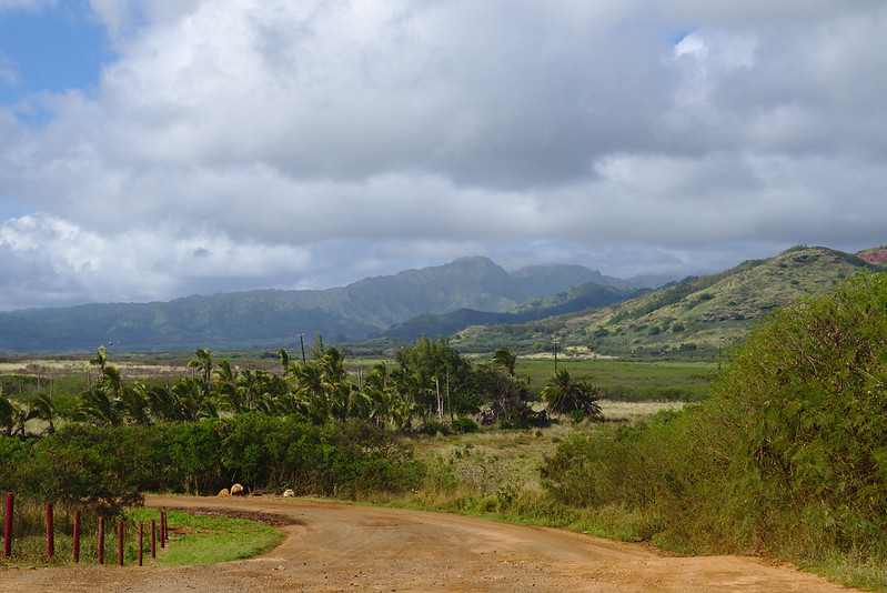
Fish tacos at Verde in Kapaa. The fish of the day is always `ahi or makimaki — and why not have both? Verde is a physically non-descript restaurant, but the tacos are memorable. It became very clear to me that I need to seek out a lot more Mexican food before having an opinion on it.
Three photos of 2015
A vastly inadequate photo of the best sunset I’ve ever seen, over the equator flying from Sydney to Vancouver:
Goodbye to San Francisco, after we shut down the Ada Initiative:
A slightly fun mirror-selfie in Bondi:
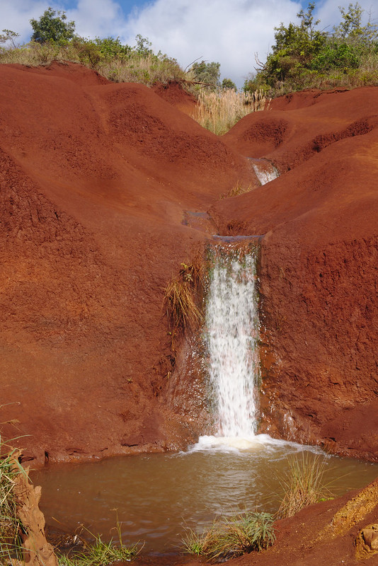
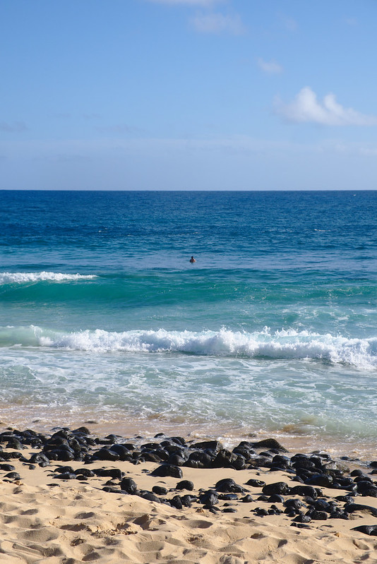
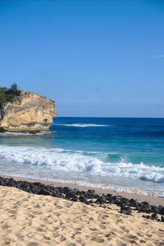
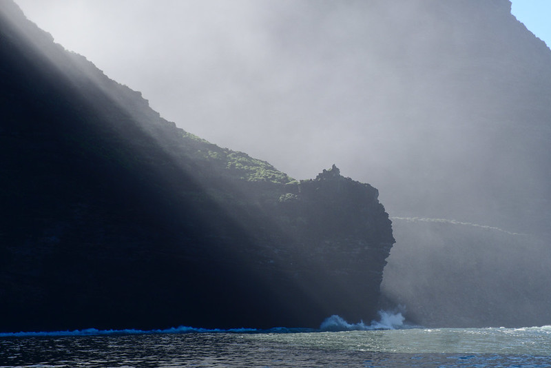
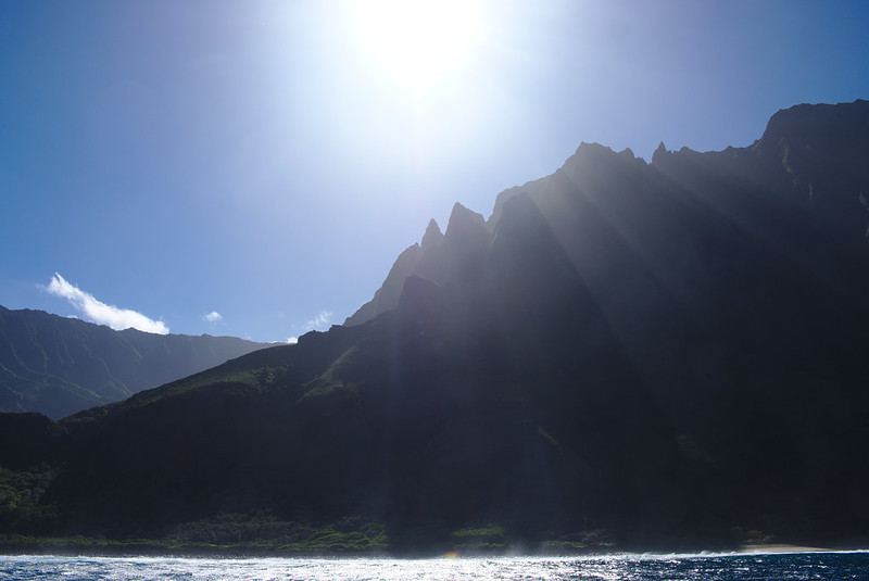
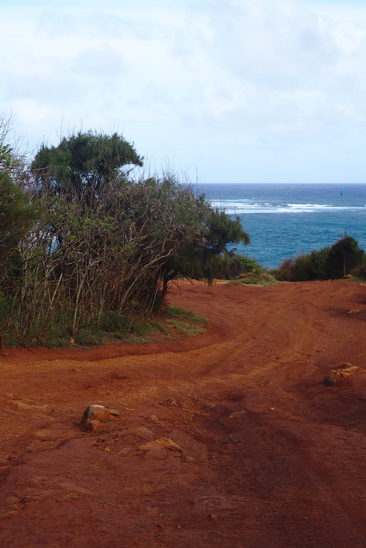
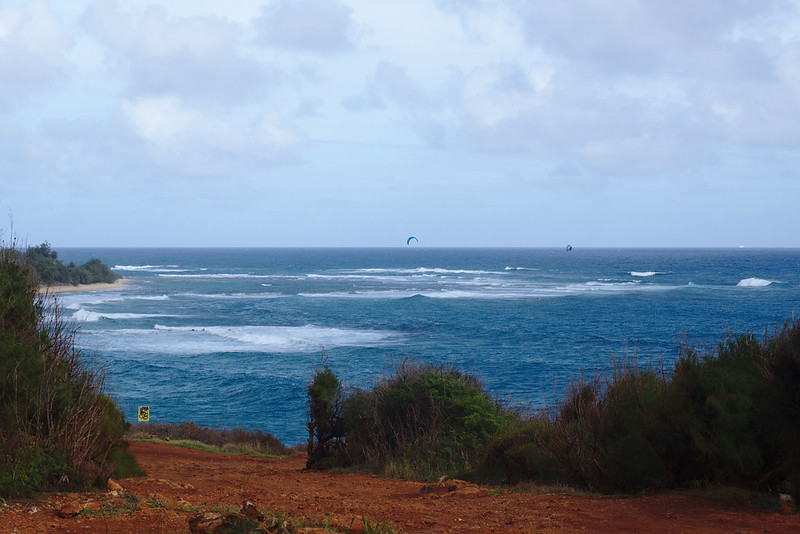
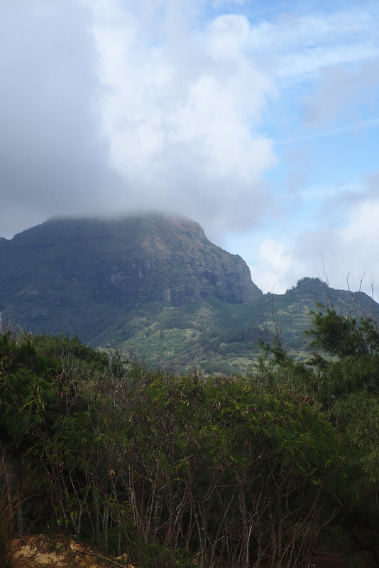
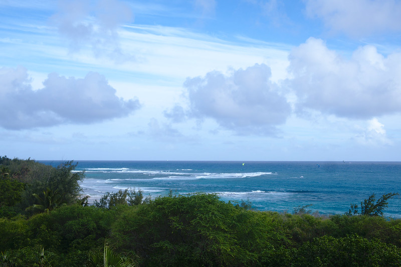
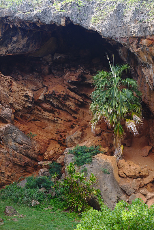
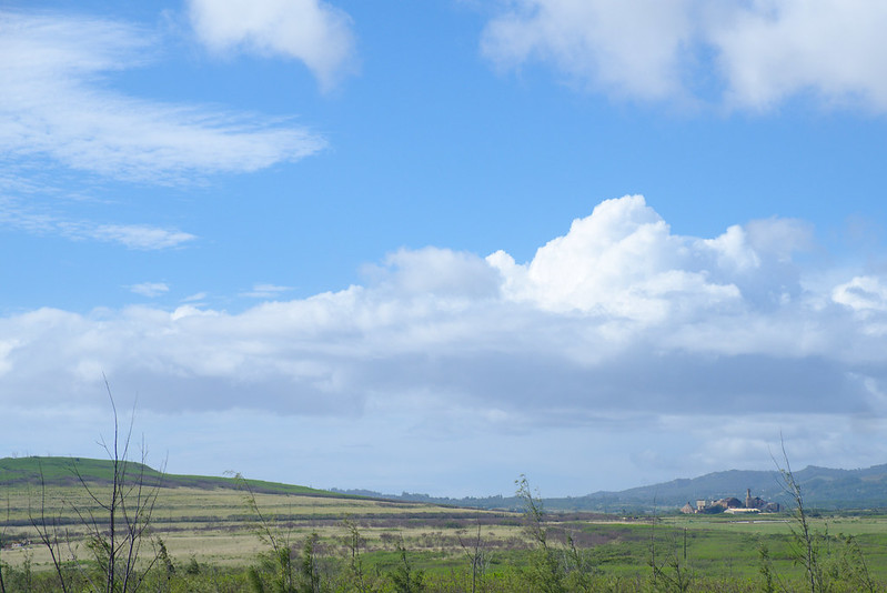
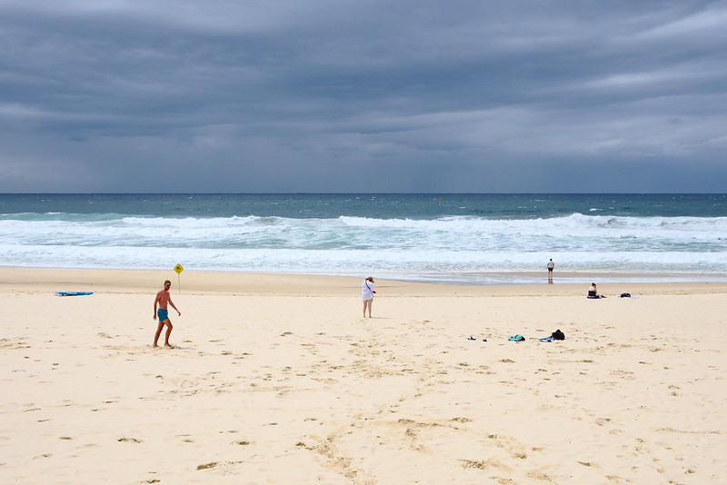
If you’re after quality rather than feels, have a look at my Bondi to Bronte and Kauaʻi photos
Three pleasures of 2015
“Child piles”: encouraging both my children to flop on top of me. They also like to hug each other. V has got bony but he’s also got a lot more considerate in the last year, so we’re having some great hugs.
Returning to the slopes at Thredbo and not falling down. And the feeling of getting my skis back under me occasionally when I started to lose it. And hot doughnuts after skiing wrapped up each day.
My two visits to Dolores Park in summer and autumn, enjoying sun and grass and sometimes slightly too many people, and nice views of distant fog, and even, one time, a rainbow. I want to go to Northern California with my family someday. Someday!
The Prime Ministership change in Australia. I am not a huge fan of the “they’re all the same anyway” analysis; I well recall that argument being made at the last Federal election, referring to a Rudd-led ALP government and an Abbott-led Coalition government. I don’t think Turnbull is here to govern for people I wish he would govern for; I don’t think the change was nothing either.
The entire Syria and ISIS and Middle East and global terror catastrophe, but particularly the Paris and San Bernardino attacks; and France’s frightening response with regards to civil liberties. I don’t feel, from this distance, like the US has responded as intensely after San Bernardino, but after Paris they had less far to fall. And in contrast to many other countries, especially mine: Germany.
Three sensations from 2015
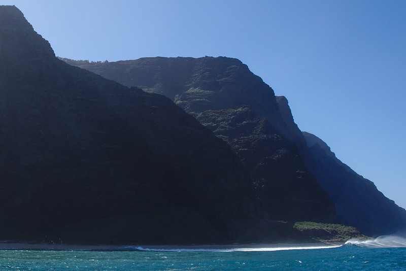
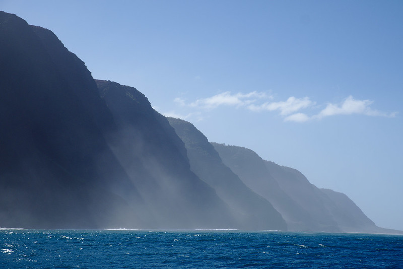
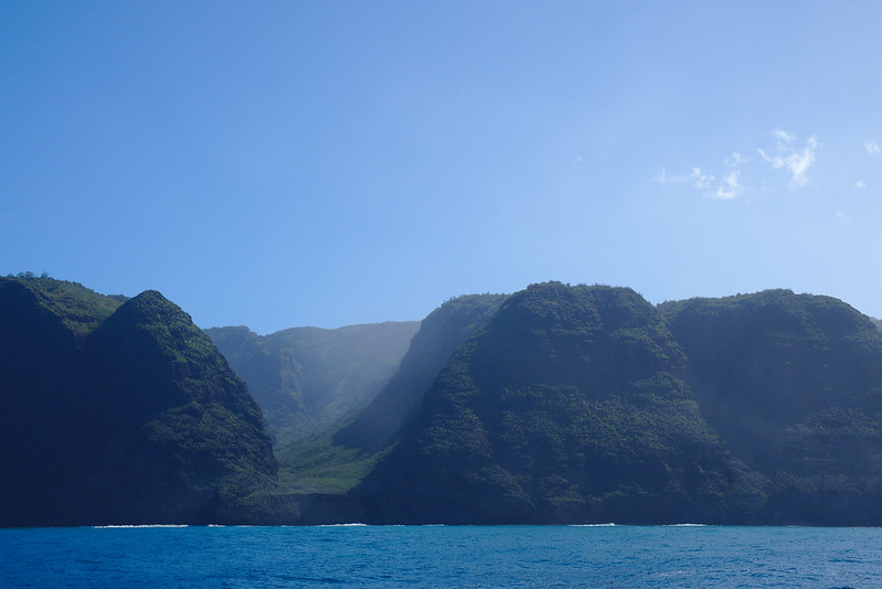
The sea spraying in my face for a half hour standing at the railing on a motor boat between Niʻihau and the Nāpali coast of Kauaʻi, to a degree where my eyes were stinging. Blood was dripping down my ankle from a previous fall on the boat. Nevertheless, it was exhilarating; my happiest moment alone for the year.
Motion sickness as I haul giant floating rafts up five flight of stairs for V at Wet ‘n’ Wild; wishing there were queues there that day so that I could get it to subside between rides.
Some of the first times my daughter has really hurt me: leaning too hard on me, jumping on me, squeezing my fingers tightly. She does this so little still that I get excited about how she’s growing up.
“Mixed feelings” is the right characterisation of how I felt about shutting down the Ada Initiative but sadness is in the mix. Specifically, I wrote the business case for shutting it down. It was very convincing. Sadly.
Cutting people who’ve died, and people I’m not in touch with, from my Christmas card list. Relatedly, recalling a three-person conversation to which both the other parties have since died.
Three plans for 2016
Work in the technology industry again, in the technical hierarchy. I’ve never stopped coding, and I’ve learned a lot about project management since I last worked in this way (in 2005). Even interviewing for positions has taught me what a different person and employee I am now. Watch this space!
An intermediate run on skis. I’m skiing twice in 2016, this really should be do-able I hope. My long term ambition probably ends at “can ski the bulk of blue runs on Australian mountains”. That’s lots of variety.
Getting to grips with Melbourne, which I will be visiting a lot. My familiarity with Melbourne right now is so low that I got a takeaway coffee there this year and had no idea where people go to sit down anywhere inside the CBD. A place I like to go and sit would be a good start.
Three hopes for 2016
So prosaic, but I would love to get daycare for my daughter in the suburb we’ve moved to, and resume our walking childcare run. It got me outside and moving every day. That’s really really turned out to be something I miss. I guess a broader version of this is integrating into the neighbourhood and suburb more, since we plan to be here a long time. Having V in the local school will help a lot.
Growing my circle of adult friends in Sydney. It is, as always, somewhat more healthy in San Francisco than it is here.
And… the continuing emergence of a persuasive economic reform plan from the left. Basic income and wealth tax experiments!
Telsa is the direct inspiration for the entire 15 years of content on this website, especially the personal diary. Before joining LinuxChix, I first knew Telsa through her online diary (its archival title, “This was a diary, once”, is painful to read now), which I heard about through someone who read Alan Cox’s diary, and I was struck by how striking daily life could be in written form. Telsa’s diary was full of personality and snark, and singlehandedly inspired me to begin writing about my life online too.
I thought of her as a net celebrity, although not in the usual way of “married to Alan Cox”, but as “writer of one of my favourite websites”. I was therefore a little bit shy about directly interacting with her when I initially joined the LinuxChix lists in 2000, but I first met her in person in 2001 at linux.conf.au when she and Malcolm Tredinnick were hanging around debriefing and complaining about CVS, on which he was teaching a tutorial that year which Telsa later wrote up. She was grumpy and kind and normal, even if she did know CVS.
Andrew saw her again at LCA in 2003, but I didn’t go and I think I only met her one more time, in Wales in 2004 when we visited their house and due to poor planning with trains, ended up staying the night. Telsa and Alan were kind hosts and we enjoyed Telsa’s huge knowledge of local history as we walked all around Swansea.
Telsa’s final diary entry in 2006 says she “plain[ly] and simpl[y] los[t] interest in running to stand still just to understand how to use anything mechanical.” However hard she worked for it, I remember her as profoundly technically knowledgeable and an excellent teacher. A great deal of my initial learning about both CSS and character encodings came from her, and she was well known as a high level user of DocBook. A friend shared one of her posts to a private LinuxChix technical list today, walking through the differences between library packages and -devel packages in Linux distributions, and their implications for compiling software.
I hadn’t been in contact with Telsa since she or I variously withdrew from our common online communities, so since 2007 or before. I kept an eye on the very occasional updates to her website, and was pleased to think that she had found a more satisfying life outside her Free Software community volunteering. I still find this a happy thought.
Telsa was also a critical inspiration to me as an activist: in the early 2000s (and still) it was hugely controversial to either believe that open source communities could still work if they were more civil (the entire LinuxChix project was partly an experiment with that), and even more so to insist that they should be. Telsa is the earliest person I can think of who stood up in an open source development community and asked it to change its norms in the direction of civility. I don’t know how heavily her online harassment experiences played a part in her departing Free Software and some online communities — I hope it wasn’t a large part — but I’m sorry it happened and I’m angry.
Telsa was a brilliant and kind and strong person, and I am sorrier than I can say that we will never be in contact again. To Alan, Debbie and others who loved her: my profound sympathies for the loss of an amazing person.