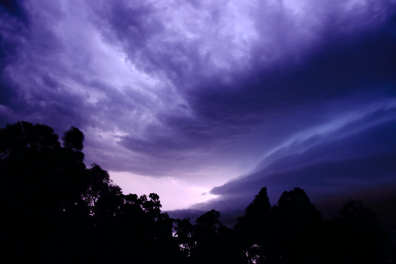
January 2021

by Mary
I normally don’t mess with the colours this heavily, but this was after dark, shot on a 3 second exposure. There’s no such thing as naturalistic colours…


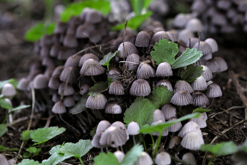
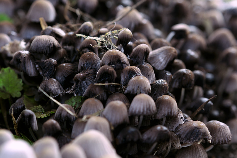
March 2020
The end of March was the season of the five reasons. It was also the beginning of the ongoing wet year. Each day we met our exercise (and general outdoor) quota by walking down to the nearest park and cycling: in V’s case riding his new mountain bike over wet turf and in A’s case, carefully paddling and balancing her pushbike as she learned to ride carefully down a hill.
On the way home on one trip, we heard, metres behind us, a small voice saying crossly “I bet that little girl”—A—”is allowed to…!”
I assumed that the question was about seeing friends or grandparents or having competitive sneezing parties, so called back to them to ask what they wanted to know. The father said not to mind but I insisted and he said “she wants to know if that little girl is allowed to eat mushrooms growing on the street”, allowing me to comfortably assert that A is not allowed to eat mushrooms found growing on the street. Neighbourhood norms, cemented.


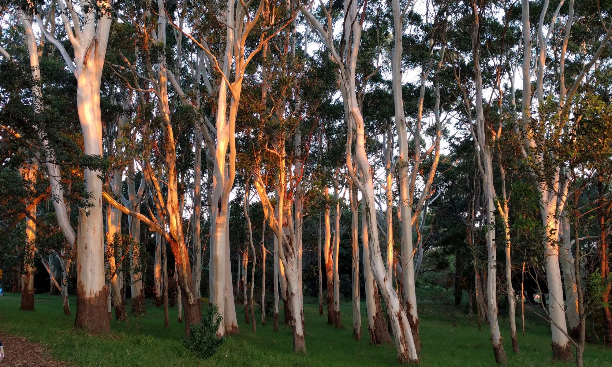
July 2019