Graphics have been spicing up my writing and slidedecks over my fifteen years as a writer and a public speaker; the simpler and more attractive the better. But it’s not easy to put them there.
I’ve had the good fortune to also have been an amateur photographer the whole time, and have taught myself some basic image editing skills, so when I find an image that’s not quite right but could be, I pop it in an image editor, twiddle a reliable and small set of dials, and out emerges something more eye-catching. Lucky me. And lucky you: the tricks to turn a photo into something simpler and more eye-catching are simple, and today is the day I share my version of them.
Are you a wordsmith more than an visual person? Are you a writer or a public speaker who appreciates the power of a strong visual in other people’s pieces and slide decks, and wish you could just twiddle a few dials and make it happen with your own images? Do you want to make featured images for a WordPress theme, or something to break up a millionty paragraphs of text, or a colourful image to re-engage your audience in your talk? Do you sometimes have an idea of what you want but the images your searches dig up are just a bit flat for your purposes? This is for you.
This entry covers two topics: first, finding existing images that you can make work for you without any further editing. Win! And the next level: when you have an idea of what you want, and you have a photo that… doesn’t quite tell that story… but could… it’s time to make some quick and dirty edits to liven it up. Make the colours a little stronger or stranger, eliminate some clutter, and pull out some detail. Your illustrations are complete!
Eye-catching photos for wordsmiths: principles
Eye-catching images accompanying to your writing or speaking should be brain candy: simple subjects that people can identify at a glance; high contrast so that most people can understand what they’re seen quickly; and understand at a glance; and brightly or interestingly coloured because it’s eye-catching and fun. Your illustrations will usually be a subtlety-free zone.
Luckily simple, colourful, and easy to understand is an appealing set of things to have in a photo, so you’ll often be able to find free photos that you can use without editing. But there’s also a very simple set of tools that will let you take an existing photo and up its simplicity and eye-catching for your work. Finding first; then failing that, editing.
Finding images
Use photos that the photographer allows to be used and changed by other people! The Creative Commons system provides photographers and others with a way to give you this right.
To find images with Creative Commons licences that match my needs, I head on over to Flickr search, with Commercial use & mods allowed selected in the “Any licence” drop down. A couple of Flickr search tips:
- search for generic terms. If you’re looking to make a point about time, first search for “clock” and “watch” and “sundial”, not things like “clock showing noon” or “bedside clock”. Images are often fairly generically labelled by their creator and you miss some good stuff by going specific.
- use Flickr’s “Interesting” search tool. There’s a dropdown labelled “Relevant” — by default Flickr is trying to find images whose textual description and tags best match your search term. Try changing it to “Interesting”, to instead find somewhat matching images that are very popular on Flickr. This will often bias towards images that are already technically good, highly saturated, have an unusual subject or setting, and similar; exactly the kind of eye-catching things you want for your blog post or slide deck.
Flickr isn’t the only Creative Commons game in town: there’s also Wikimedia Commons or Google Images (after your search, go to “Search tools”, then “Usage rights” then “Labeled for reuse with modification”.
Caution: often images found this way must still be credited to their creator. Learn more here.
Caution: be careful of images with recognisable people in them. The permission you got to use the image was from the photographer, not the subject. Ethically, the person in the photo may not wish to have their likeness appear with your content, and in some cases using images of people may be restricted by personality rights or privacy rights. It’s usually best to skip images of people, or to buy them from a reputable stock image site.
[Update 2019: Tanya Reilly has surveyed more ways of finding freely licenced photos, including sites where all of the photos are Creative Commons Zero/public domain.]
Editing tools
The point of this tutorial is to make adjustments to some of the most common “knobs” you can twiddle on digital images. If you want to start making edits, and you already have a tool in mind, look up how to crop, how to auto adjust levels, how to change saturation, how to change contrast, and how to change brightness in your chosen graphics software.
In this tutorial, I’ve made the edits to images with Pinta, a free and comparatively simple graphics program for Windows, Mac, and Linux. I haven’t used them, but Paint.NET is a widely recommended equivalently straightforward Windows image editor, and Pixelmator seems highly recommended on Mac.
Editing photos to be eyecatching: short version
- crop the image so that the subject of interest comprises most of the image, and is off-center
- try auto-level colour adjustments
- try somewhat increasing one or more of contrast and saturation, perhaps while twiddling brightness up or down
- also try decreasing saturation
That’s it! If you want examples of what this looks like in action, read on!
Editing photos to be eyecatching: with examples
Meet our original images
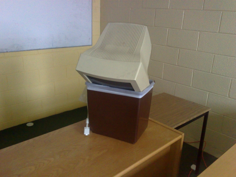
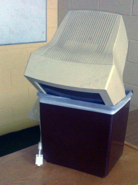
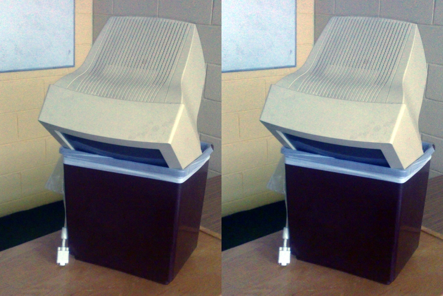
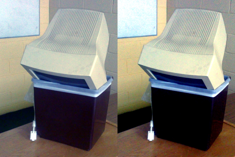
Old Computer by Sean MacEntee. Old Computer is a surprisingly rare beast: a freely licenced photo of a computer that is being discarded. I find it easy to find great photos for search terms like apple or pen, less so for “computer in trash”. It’s a problem when you write complaints about computers a lot.
Old Computer has two major limitations if you wanted it for your condemnation of the tech industry or your rage at discarding electronics into landfill:
- it’s “flat” colour-wise: there’s a lot of very similar beige-y colours in the image
- there’s a lot of classroom in the shot and not a lot of computer-in-bin
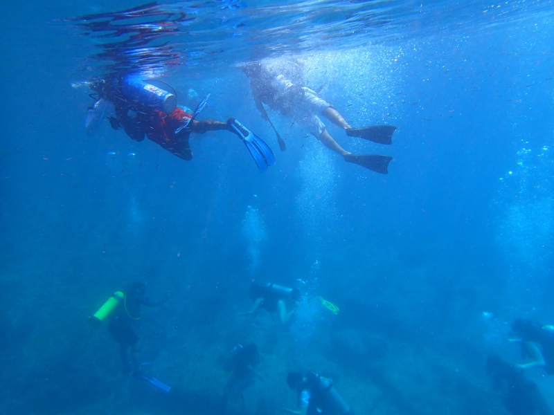
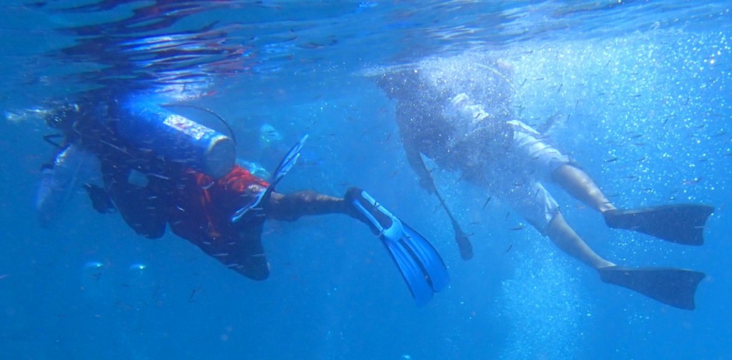
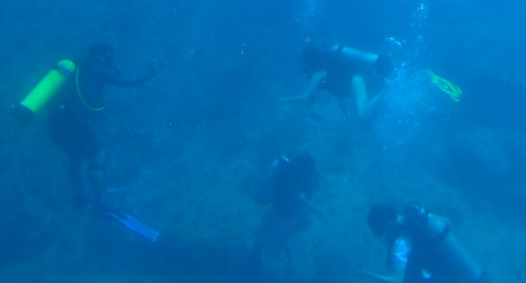
PC270246 by NickDun (hereafter called SCUBA). This is a very evocative shot of what scuba diving in a group is like and would be a great addition to your story of getting your mask kicked off by that so-and-so who probably certified yesterday, but:
- it’s a very typical shot taken with an underwater camera, that is, it’s extremely blue-tinted
- there’s a lot going on in it; if you want to talk about sunlight and freedom, or if you want to talk about crowds of divers, you may only want to illustrate your post with part of the image
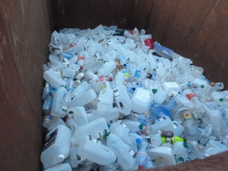
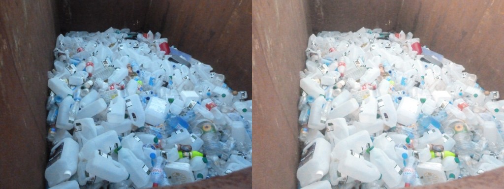
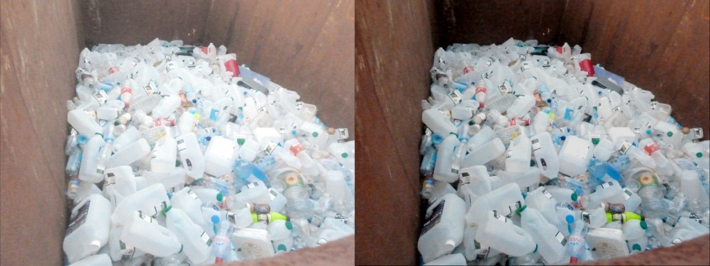
Big Rubbish Project: Eden Project 2011 by University of Exeter (hereafter called Big Rubbish). What can I say? Garbage is a versatile metaphor and images of garbage are useful. This image is visually striking: there’s lots of repetition and patterns, and not a lot of extraneous clutter in the surrounding scene. But it also has rather dim, flat colours.
Step 1: crop
Old Computer has an issue with a lot of surrounding space; and SCUBA has two separate things going on in it. This we are going to fix by cropping the image. Cropping means cutting out some of the photo. Where possible, you want to cut out other unrelated objects, and large expanses of foreground and background.
Cropping principle: have the object of interest filling most of the photo, slightly off center.
In Pinta, select the Rectangle Select tool, drag to draw a rectangle over the bits of the image you want to keep, and then go to the Image menu and select Crop to Selection.
Old Computer, cropped so that the computer and the bin occupy much more of the image:
And two crops of SCUBA, the first showing the divers snorkelling at the top of the image and the second showing the divers grouped at the bottom:
Honestly I’m a bit sad to crop SCUBA, because the full image is so evocative of the last two or three minutes of SCUBA dives. Let this serve as a lesson: none of this editing is compulsory. Sometimes let less be more.
I’m even more loath to crop Big Rubbish, since as I noted at in its introduction I quite like its current framing. But one possibility with cropped is to change the message of the picture a little. For example, here’s a crop that implies that the extent of the garbage could be much larger:
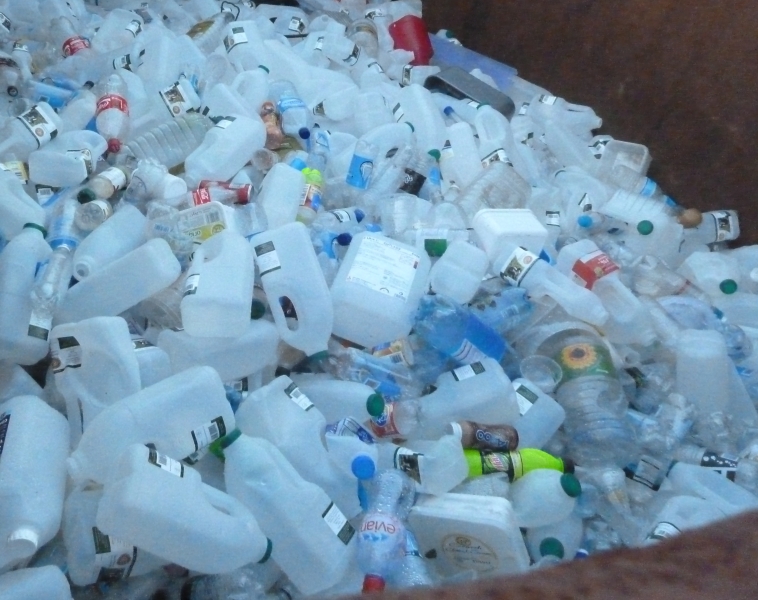
An even tighter crop, taking out the edges on the bottom and right could imply that it wasn’t well contained.
Having made that illustrative crop, I’ll go back to working with the full version of Big Rubbish in future steps.
Further reading: Rule of Thirds for a guideline on centering or not centering your object of interest.
Step 2: auto level
At the start, we saw that all of Old Computer, SCUBA, and Big Rubbish have “flat colours”. “Auto level” commands are the simplest way to get a good variety of colour levels to diminish this effect.
In Pinta, go to the Adjustments menu, and select Auto Level.
The effect on Big Rubbish is most dramatic and most of an improvement for eye-catching purposes (original on left, auto-levelled on right):
Contrary to (my) expectations, the effect on Old Computer is extremely subtle (original on left, auto-level on right):
But don’t worry, we’re not stopping here with jazzing up Old Computer.
The effect on the two SCUBA shots is dramatic, as it often is with underwater shots. Here’s the top one (original image at top, auto-level at bottom):
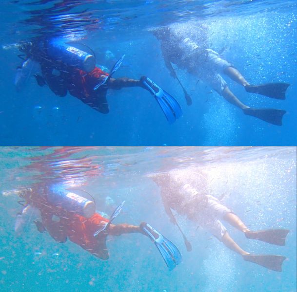
You’ll notice that while the range of colours in the auto-levelled picture is wider, it has not ended up looking especially realistic. Realistic high-fidelity underwater photographs are not easy to produce… but luckily realistic is not our goal here; our goal is striking.
Sadly, the bottom crop of SCUBA is pushing the limits of colour adjustment: if there’s really only blue in the picture, auto-level will find red where-ever it can, no matter how ill-advised (original image at top, auto-level at bottom):
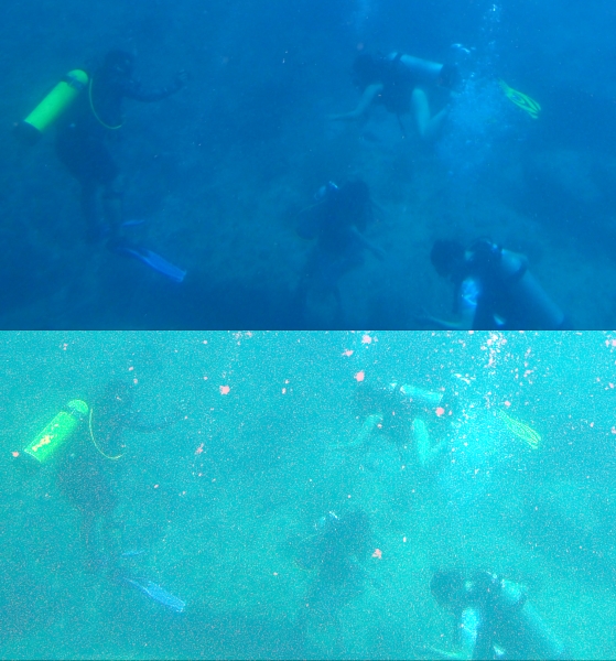
Not so great. But give auto-levelling a go with any picture you are trying to edit; there’s always an Undo command.
Step 3: increase contrast and saturation
Increasing contrast increases the distinctness of the colours in the image (beyond auto-level); and increasing saturation increases their richness.
In Pinta, go to the Adjustments menu, and choose “Brightness / Contrast” for a contrast slider, and “Hue / Saturation” for a saturation slider.
Here’s Old Computer, with the Saturation slider (which starts at 100) increased to 150, and the Contrast slider (which starts at 0) increased to 30 (auto-levelled version on left, higher contrast and saturation version on right):
And here’s Big Rubbish, with three adjustments. I took Saturation to 130, contrast up to 20, and brightness down to -50 (auto-levelled version on left, higher contrast, higher saturation version, and lower brightness version on right):
Since I’ve made it darker again, and thus more like the original, let’s keep ourselves honest and compare with the original too (original on left, auto-levelled with lower brightness, higher contrast, and higher saturation version on right):
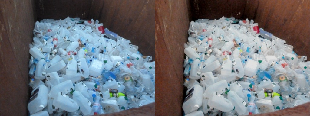
Our version has a lot more red: the bottles are white rather than blue, and the rusty bin has a warm red tone (partly due to auto-levelling and partly due to increasing the saturation dramatically). So auto-levelling and messing with the colours paid off even though I went and reduced the brightness back down to close to the original.
Saturation is a very powerful slider: make your colours richer by increasing saturation.
That said, sometimes you can do a lot just with contrast. Remember what a mess auto-levelling made of the bottom SCUBA picture? I didn’t give up there. Here’s a version based on the original, with brightness increased to 20 and contrast to 70 (original crop on top, higher contrast and higher brightness version on bottom):
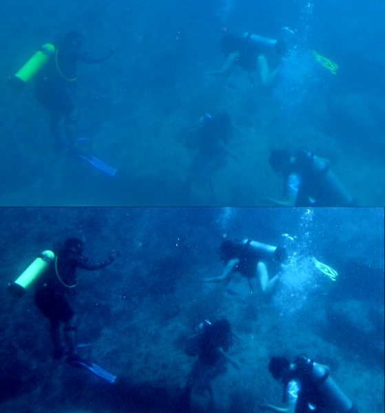
Here manually fiddling with brightness and contrast has pulled some detail out of the picture that auto-levelling didn’t manage to find, and made it much more striking while retaining the other-worldly darkness of SCUBA diving. (Spoiler: your eyes are better than cameras at adjusting, it doesn’t seem that dark while you’re doing it. But you might want to convince your readers or listeners that it is spooky-dark…)
Step three alternative: decrease saturation
Upping saturation to make your rust warm, and your water an inviting sunny-day blue can be very effective, but it’s also worth checking out what effect you get from dialling saturation both ways.
Here’s the top of the SCUBA shot (top version auto-levelled, middle version auto-levelled with contrast increased to 20 and saturation increased to 155, bottom version with contrast increased to 35 and saturation decreased to 25):
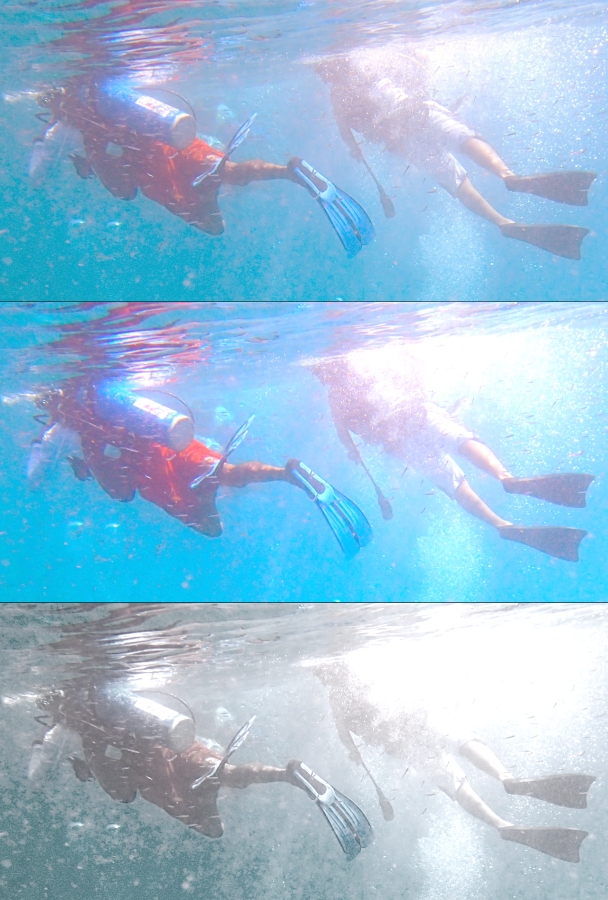
Both of the edits have something to recommend them: the more saturated version in the middle looks like the sunniest dive day in the history of time, and the less saturated version at the bottom looks ethereal and dramatic; my favourite edit that I produced for this post. Try dialling saturation down sometimes, not always and forever up.
And that’s it: you have your basic dials to catch eyes now!
Two minutes to more eye-catching photos
Full disclosure: you’ll have to do a bit of practice to develop your own taste. But here’s your quick steps when you have a photo that could use a bit of “pop” before being added to your writing or your slide deck:
- crop the image so that the subject of interest comprises most of the image, and is off-center
- try auto-level colour adjustments
- try somewhat increasing one or more of contrast and saturation, perhaps while twiddling brightness up or down
- also try decreasing saturation
And so wordsmith types: go forth and give people brain candy!
