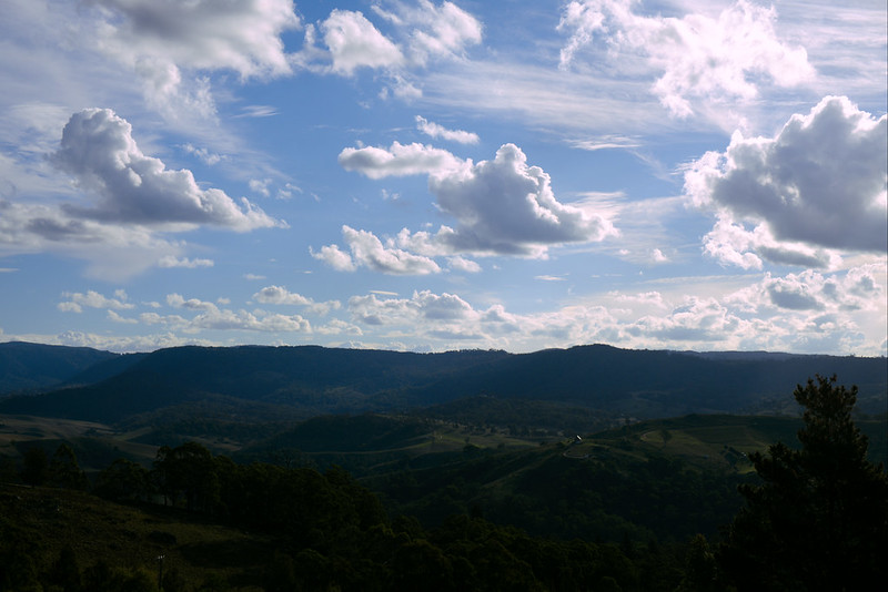
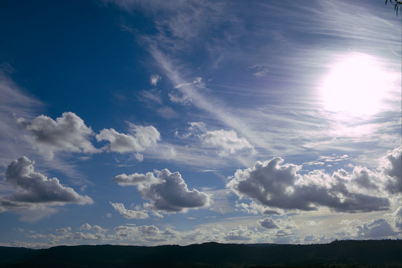
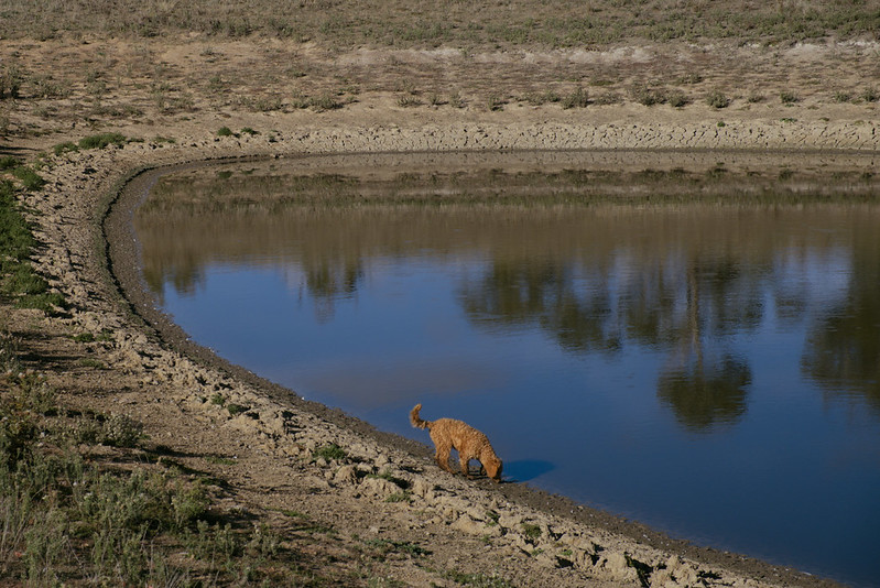
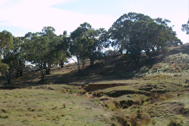
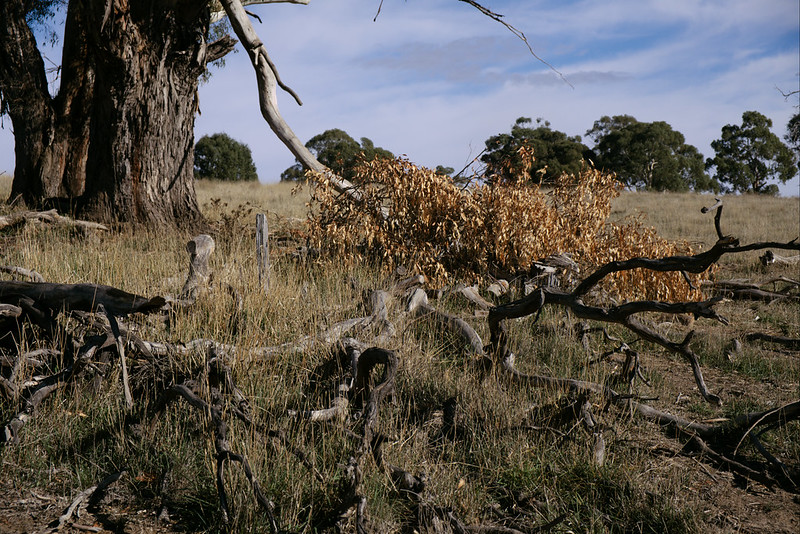
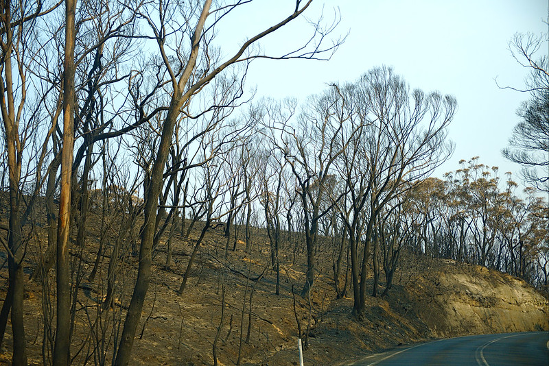
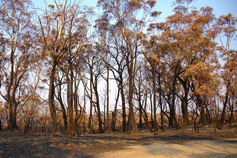
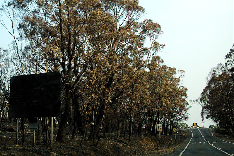
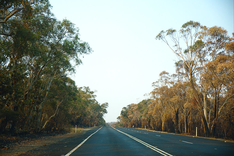
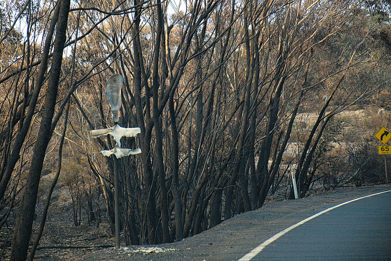
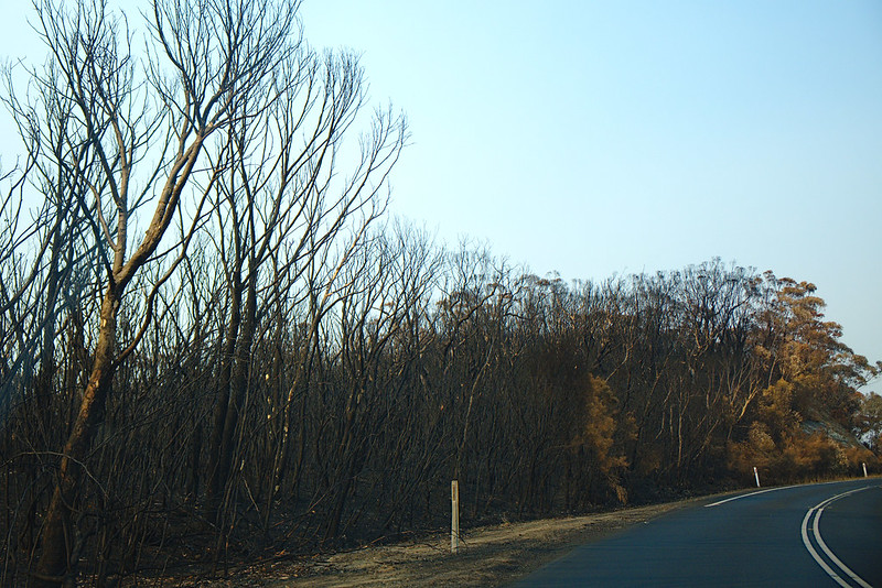
We’ve had a snow holiday in Thredbo four years in a row, and are talking about a change. But saying goodbye to the hour of road near it will be hard:
Late afternoon
Sunlight
Autumn photography 2017
I switched camera systems in May this year to a mirrorless system, specifically a Fuji XT-20 body with various lenses. Its first big expedition was to New York but soon enough it was time for the much closer to home annual trek around the autumn foliage. The camera body failed around mid-day (had to go in for repairs as it was unable to detect lenses connected to it), very poor timing since Andrew’s niece was born that day, but we had some adventures first.
I remain fascinated by the ludicrous, alien, ornamental pear that is planted in such profusion around here:
But eucalypts can hold their own:
Superhumanised methyl: an infallible process for naming things
“I’m no good at names” said pretty much everyone I’ve ever founded and named a project with. Of course you aren’t because how often does one found and name a project? It’s a learned skill. You’ll get better at naming things as you name more things.
I’ve been following the same naming process since we named the Ada Initiative and it’s worked well several times; we came up with a name that we liked and the project didn’t split up over the issue of naming. I thus feel like it’s ready for public release and declaration of infallibility.
What are you trying to name?
Get down a short description of the thing you are trying to name: a two sentence summary, a mission statement, or similar. Eg: “a group blog for people who both knit and crochet”, “a future multinational oil company” or “a street festival”.
This may sound really obvious — why would you be naming something before you know what it is? — but in fact often you have to name things before almost anything else happens, because the name will need to go in your domain, in your incorporation paperwork, in your Twitter handle and so on. Often the need for a name arrives simultaneously with the need for a mission statement; get a short summary down as you currently understand your project.
Consider the obvious
I tend to lean to names that are fairly abstract, because I want to avoid asserting a particular kind of authority for a new project. For example, the Ada Initiative was not named “the Women in Open Source Initiative” for the reason that we weren’t intending to be an umbrella group or a one-stop-shop. Separately, abstract names are apparently easier to establish as a trademark (of course, if trademarkability is an important consideration for you, involve an intellectual property lawyer in your naming process).
But that said, it’s worth considering if you should be “the Winter Street Fair” or “the Crafters Blog” or “Oil, Incorporated” before you disappear into the web of name possibilities.
Assuming you’ve decided not to go with a descriptive name, it’s time to…
Come up with sources of metaphors
This is the part where I personally get stuck on “but I’m terrible at coming up with metaphors”. But again, you don’t have to do this cold. Think about:
- your field: tools and technologies, sources of meaning and difference and status within it (quality, skill, design, distinctiveness, price, reliability, longevity, sub-cultural elements…)
- history: early figures in the field/region, early tools and technologies, important places and their names
- related fields and their tools and technologies, important places and so on
- natural phenomena are very established metaphors: weather for energy/change, fire for destruction/renewal, wilderness (and space) for adventurousness, water for soothing/endurance/relentlessness
Your craft blog: historical crafters, historical technologies (eg the names of early looms), current technologies, colours, stitches, patterns, garments.
Your street festival: historical residents of the area, earlier names for the locality, street names, seasons and weather, local wares.
Your oil company: earth, power… varieties of hats? Pollution? Seriously, don’t get me to name your oil company.
Quite a lot of fields have a well-established metaphor, eg, “cloud” for computer servers hosted by other people (and earlier, for the wider Internet in general, often depicted as a cloud in diagrams). Add this and related metaphors to your sources of metaphor.
Create a list of possible names or part names.
Now you have your sources of metaphor, use them to come up with specific possible names. This is brainstorming with reference materials. I use either a thesaurus or Wikipedia to get down as many ideas as possible.
Valerie wanted to name the Ada Initiative for Ada Lovelace, but the second part of the name came from thinking about wanting to capture, essentially, activity, and then following networks of words related to activity, forward motion, and change around a thesaurus. I’ve named other things by working my way through Wikipedia categories and lists.
If I was naming a provider of cloud computing services and wanted to stick close to the cloud metaphor, this is some of what I’d end up with from this process:
- from thesauruses, based on “cloud”: steam, vapour, nebula, dapple(d), overcast
- from Wikipedia, poking around cloud and weather categories: hector, cloudburst, flanking line, cumulus, stratus, mushroom
If I was going to be going for high reliability, I might go with ground/grounded as a metaphor instead, and some of the following might end up on the list:
- from thesauruses, based on “earth”: clay, loam, pottery, cave, nest, field, holding, home, soil, tillage
- from Wikipedia, looking around soil-related categories: brown earth, mire, loam, terra, peat
This is the long-listing phase: Put down every possible name that you vaguely like. Don’t be bound by your sources of metaphor, consider adding words you’ve always liked or cool words you find randomly flipping in a dictionary, fragments of your personal motto, abandoned names from previous projects. There’s already a ton of filtering going on here (eg, it turns out there’s a whole lot of trademarked soil products ending in -sol I didn’t include) but don’t do it systematically yet. Just avoid writing down stuff you hate.
If I was looking for/open to a two word phrase, I’d both allow them here (“red soil”) and do the same process for the second half of a name (“initiative”).
You can cautiously branch out into other languages. I tend to end up at Latin pretty quickly because there’s less cultural appropriation issues than with many living languages, and English speakers can usually figure out a plausible pronunciation of the name.
Whittle down the list.
It’s time for the short-listing phase. You can do this by gut: get rid of “meh” names. This is also a good time to add a bunch of practical constraints to help cut it down. For example:
- does it have connotations you don’t intend? (eg “girls” for a women’s group will at some point cause people to start asking questions about the age range of members)
- how formal is the name, compared with your intentions?
- is it striking and memorable?
- is the origin story of the name entertaining and OK to share? (you may be asked for it)
- is an appropriate domain name/Twitter handle/your landgrab here available?
- is it easy to spell? (joke is on me: it took me ages to learn to type “initiative” reliably)
- will people understand it when you say it over the phone? (trick question, this is never true, barring naming your new project “John” — or wait, was that “Jon”? — but if you keep it short at least spelling it out won’t be time consuming)
- do you like the acronym or short form? does it have its own spelling or confusion issues? (the Ada Initiative used to receive a fair bit of correspondence concerning the Americans with Disabilities Act and the American Diabetes Association, both known as ADA)
- is there a similar trademark?
- is it a “style” of name widespread in your market (eg, two word names are common, or single syllables are common, or naming things in memory of is common) and do you want to nod to that or depart from it?
- is it a word in other languages, and if so, what does it mean?
- are you borrowing a term from a dispossessed or disadvantaged group? (eg using an Indigenous word for a non-Indigenous-centered thing in Australia)
The specific constraints will vary: I’ve rarely had to care about trademarks so far, and the fewer things I have to spell out over the phone the better. You’ll probably refine your criteria as you strike individual names.
Often at the end of this process you’ll be down to five names or less. One catch: you are pretty tired and bored by this point. Be sure you get rid of any name you in fact hate, no matter how good it seems by your criteria, because otherwise you risk choosing it out of exhaustion or inertia. In a group setting, you will need to risk a bit of conflict by trying to draw out “does anyone actually just hate any of these?”
The last one
Sometimes if you are lucky, you only have one candidate left, or else one that is just the best by far. You have a winner!
Otherwise, this is tricky. You’ve looked at the names so long you’ve started to lose any sense of their goodness. However, the whole painful preceeding process means that something that has made it this far is likely to be a perfectly fine name that you will grow attached to over time. Possibilities for making the final decision include: allowing no-reason vetos, votes, tasking one person with making the call. It can be worth taking an hour or two imagining the name in use: on your posters, your business card, your graffiti.
Postscript: what’s up with “superhumanised methyl”? Super? Human? Ised? Methyl? Well, I knew I needed to perform flawlessly in naming this entry, and so I did not do any of the above process but instead ran my random word generator a bunch of times until I got something I vaguely liked. However, in the spirit of full disclosure: I did change it to Commonwealth spelling.
Autumn photography 2015 & 2016
Last year, inner west autumn in the rain:
This year, in the wake of one of the heaviest couple of days of rainfall I’ve ever experienced, and after such a warm autumn that the leaves in fact turn in winter, inner west autumn in the sun:
✨ puzzlemoji ✨ WTF cake, nopetopus, ban Australia, and more!
The advent of the Slack chat program and its custom emoji and reactji has inspired me to break out Inkscape a number of times, usually mightily assisted by Open Clip Art artists, to express sentiments not yet captured by the Unicode consortium, such as NOPE or BAN AUSTRALIA.
Some of my emoji are already leaking out into the Slackerverse; it’s time to set them all free, and spread the nopetopus and no fucks far and wide! Get your puzzlemoji from the Gitlab repository or download them directly from this page.
All these emoji are public domain (I’d love to see you work out how to credit them inline), but I appreciate a shoutout where possible. In turn, credits for images I adapted can be found in “More information” links.
:banaustralia:
Let’s face it, banning Australia is the least you can do, ban early and often.
:banbrains:
When you’re feeling the need to distance yourself from your own brain, the radical action of prohibiting it may help.
:nofucks:
Inspired by the Look At All The Fucks I Give images, communicate your entire lack of fucks:
:nope: :nopetopus:
Nothing says NOPE like the nopetopus popularised (created?) by lauralex on Tumblr. For when even a cephalopod cannot be having with this nonsense:
:trashfire:
One of my most undeservedly praised emoji in terms of how much I adapted the source material! :trashfire:
involved taking this image and removing several objects from it. Voilà!
:uterus: :banuterus:
There are all kinds of reasons to want to uterise your chat, both positively and negatively. The extreme ends of attitudes to uteruses can now be expressed in reactji:
:wtf: :wtfcake:
The best way to express What The Fuck sentiments is obviously and forever via baking a WTF cake (hat tip Selena Deckelmann). Now in nommable emoji form!
Other puzzlemoji
Lots of banning remains to you:
:bandoctors:
: SVG, 128px PNG, more information:banfamilies:
: SVG, 128px PNG, more information:bangermany:
: SVG, 128px PNG, more information:banusa:
: SVG, 128px PNG, more information
Eye-catching graphics in two minutes: a wordsmith’s guide
Graphics have been spicing up my writing and slidedecks over my fifteen years as a writer and a public speaker; the simpler and more attractive the better. But it’s not easy to put them there.
I’ve had the good fortune to also have been an amateur photographer the whole time, and have taught myself some basic image editing skills, so when I find an image that’s not quite right but could be, I pop it in an image editor, twiddle a reliable and small set of dials, and out emerges something more eye-catching. Lucky me. And lucky you: the tricks to turn a photo into something simpler and more eye-catching are simple, and today is the day I share my version of them.
Are you a wordsmith more than an visual person? Are you a writer or a public speaker who appreciates the power of a strong visual in other people’s pieces and slide decks, and wish you could just twiddle a few dials and make it happen with your own images? Do you want to make featured images for a WordPress theme, or something to break up a millionty paragraphs of text, or a colourful image to re-engage your audience in your talk? Do you sometimes have an idea of what you want but the images your searches dig up are just a bit flat for your purposes? This is for you.
This entry covers two topics: first, finding existing images that you can make work for you without any further editing. Win! And the next level: when you have an idea of what you want, and you have a photo that… doesn’t quite tell that story… but could… it’s time to make some quick and dirty edits to liven it up. Make the colours a little stronger or stranger, eliminate some clutter, and pull out some detail. Your illustrations are complete!
Eye-catching photos for wordsmiths: principles
Eye-catching images accompanying to your writing or speaking should be brain candy: simple subjects that people can identify at a glance; high contrast so that most people can understand what they’re seen quickly; and understand at a glance; and brightly or interestingly coloured because it’s eye-catching and fun. Your illustrations will usually be a subtlety-free zone.
Luckily simple, colourful, and easy to understand is an appealing set of things to have in a photo, so you’ll often be able to find free photos that you can use without editing. But there’s also a very simple set of tools that will let you take an existing photo and up its simplicity and eye-catching for your work. Finding first; then failing that, editing.
Finding images
Use photos that the photographer allows to be used and changed by other people! The Creative Commons system provides photographers and others with a way to give you this right.
To find images with Creative Commons licences that match my needs, I head on over to Flickr search, with Commercial use & mods allowed selected in the “Any licence” drop down. A couple of Flickr search tips:
- search for generic terms. If you’re looking to make a point about time, first search for “clock” and “watch” and “sundial”, not things like “clock showing noon” or “bedside clock”. Images are often fairly generically labelled by their creator and you miss some good stuff by going specific.
- use Flickr’s “Interesting” search tool. There’s a dropdown labelled “Relevant” — by default Flickr is trying to find images whose textual description and tags best match your search term. Try changing it to “Interesting”, to instead find somewhat matching images that are very popular on Flickr. This will often bias towards images that are already technically good, highly saturated, have an unusual subject or setting, and similar; exactly the kind of eye-catching things you want for your blog post or slide deck.
Flickr isn’t the only Creative Commons game in town: there’s also Wikimedia Commons or Google Images (after your search, go to “Search tools”, then “Usage rights” then “Labeled for reuse with modification”.
Caution: often images found this way must still be credited to their creator. Learn more here.
Caution: be careful of images with recognisable people in them. The permission you got to use the image was from the photographer, not the subject. Ethically, the person in the photo may not wish to have their likeness appear with your content, and in some cases using images of people may be restricted by personality rights or privacy rights. It’s usually best to skip images of people, or to buy them from a reputable stock image site.
[Update 2019: Tanya Reilly has surveyed more ways of finding freely licenced photos, including sites where all of the photos are Creative Commons Zero/public domain.]
Editing tools
The point of this tutorial is to make adjustments to some of the most common “knobs” you can twiddle on digital images. If you want to start making edits, and you already have a tool in mind, look up how to crop, how to auto adjust levels, how to change saturation, how to change contrast, and how to change brightness in your chosen graphics software.
In this tutorial, I’ve made the edits to images with Pinta, a free and comparatively simple graphics program for Windows, Mac, and Linux. I haven’t used them, but Paint.NET is a widely recommended equivalently straightforward Windows image editor, and Pixelmator seems highly recommended on Mac.
Editing photos to be eyecatching: short version
- crop the image so that the subject of interest comprises most of the image, and is off-center
- try auto-level colour adjustments
- try somewhat increasing one or more of contrast and saturation, perhaps while twiddling brightness up or down
- also try decreasing saturation
That’s it! If you want examples of what this looks like in action, read on!
Editing photos to be eyecatching: with examples
Meet our original images
Old Computer by Sean MacEntee. Old Computer is a surprisingly rare beast: a freely licenced photo of a computer that is being discarded. I find it easy to find great photos for search terms like apple or pen, less so for “computer in trash”. It’s a problem when you write complaints about computers a lot.
Old Computer has two major limitations if you wanted it for your condemnation of the tech industry or your rage at discarding electronics into landfill:
- it’s “flat” colour-wise: there’s a lot of very similar beige-y colours in the image
- there’s a lot of classroom in the shot and not a lot of computer-in-bin
PC270246 by NickDun (hereafter called SCUBA). This is a very evocative shot of what scuba diving in a group is like and would be a great addition to your story of getting your mask kicked off by that so-and-so who probably certified yesterday, but:
- it’s a very typical shot taken with an underwater camera, that is, it’s extremely blue-tinted
- there’s a lot going on in it; if you want to talk about sunlight and freedom, or if you want to talk about crowds of divers, you may only want to illustrate your post with part of the image
Big Rubbish Project: Eden Project 2011 by University of Exeter (hereafter called Big Rubbish). What can I say? Garbage is a versatile metaphor and images of garbage are useful. This image is visually striking: there’s lots of repetition and patterns, and not a lot of extraneous clutter in the surrounding scene. But it also has rather dim, flat colours.
Step 1: crop
Old Computer has an issue with a lot of surrounding space; and SCUBA has two separate things going on in it. This we are going to fix by cropping the image. Cropping means cutting out some of the photo. Where possible, you want to cut out other unrelated objects, and large expanses of foreground and background.
Cropping principle: have the object of interest filling most of the photo, slightly off center.
In Pinta, select the Rectangle Select tool, drag to draw a rectangle over the bits of the image you want to keep, and then go to the Image menu and select Crop to Selection.
Old Computer, cropped so that the computer and the bin occupy much more of the image:
And two crops of SCUBA, the first showing the divers snorkelling at the top of the image and the second showing the divers grouped at the bottom:
Honestly I’m a bit sad to crop SCUBA, because the full image is so evocative of the last two or three minutes of SCUBA dives. Let this serve as a lesson: none of this editing is compulsory. Sometimes let less be more.
I’m even more loath to crop Big Rubbish, since as I noted at in its introduction I quite like its current framing. But one possibility with cropped is to change the message of the picture a little. For example, here’s a crop that implies that the extent of the garbage could be much larger:
An even tighter crop, taking out the edges on the bottom and right could imply that it wasn’t well contained.
Having made that illustrative crop, I’ll go back to working with the full version of Big Rubbish in future steps.
Further reading: Rule of Thirds for a guideline on centering or not centering your object of interest.
Step 2: auto level
At the start, we saw that all of Old Computer, SCUBA, and Big Rubbish have “flat colours”. “Auto level” commands are the simplest way to get a good variety of colour levels to diminish this effect.
In Pinta, go to the Adjustments menu, and select Auto Level.
The effect on Big Rubbish is most dramatic and most of an improvement for eye-catching purposes (original on left, auto-levelled on right):
Contrary to (my) expectations, the effect on Old Computer is extremely subtle (original on left, auto-level on right):
But don’t worry, we’re not stopping here with jazzing up Old Computer.
The effect on the two SCUBA shots is dramatic, as it often is with underwater shots. Here’s the top one (original image at top, auto-level at bottom):
You’ll notice that while the range of colours in the auto-levelled picture is wider, it has not ended up looking especially realistic. Realistic high-fidelity underwater photographs are not easy to produce… but luckily realistic is not our goal here; our goal is striking.
Sadly, the bottom crop of SCUBA is pushing the limits of colour adjustment: if there’s really only blue in the picture, auto-level will find red where-ever it can, no matter how ill-advised (original image at top, auto-level at bottom):
Not so great. But give auto-levelling a go with any picture you are trying to edit; there’s always an Undo command.
Step 3: increase contrast and saturation
Increasing contrast increases the distinctness of the colours in the image (beyond auto-level); and increasing saturation increases their richness.
In Pinta, go to the Adjustments menu, and choose “Brightness / Contrast” for a contrast slider, and “Hue / Saturation” for a saturation slider.
Here’s Old Computer, with the Saturation slider (which starts at 100) increased to 150, and the Contrast slider (which starts at 0) increased to 30 (auto-levelled version on left, higher contrast and saturation version on right):
And here’s Big Rubbish, with three adjustments. I took Saturation to 130, contrast up to 20, and brightness down to -50 (auto-levelled version on left, higher contrast, higher saturation version, and lower brightness version on right):
Since I’ve made it darker again, and thus more like the original, let’s keep ourselves honest and compare with the original too (original on left, auto-levelled with lower brightness, higher contrast, and higher saturation version on right):
Our version has a lot more red: the bottles are white rather than blue, and the rusty bin has a warm red tone (partly due to auto-levelling and partly due to increasing the saturation dramatically). So auto-levelling and messing with the colours paid off even though I went and reduced the brightness back down to close to the original.
Saturation is a very powerful slider: make your colours richer by increasing saturation.
That said, sometimes you can do a lot just with contrast. Remember what a mess auto-levelling made of the bottom SCUBA picture? I didn’t give up there. Here’s a version based on the original, with brightness increased to 20 and contrast to 70 (original crop on top, higher contrast and higher brightness version on bottom):
Here manually fiddling with brightness and contrast has pulled some detail out of the picture that auto-levelling didn’t manage to find, and made it much more striking while retaining the other-worldly darkness of SCUBA diving. (Spoiler: your eyes are better than cameras at adjusting, it doesn’t seem that dark while you’re doing it. But you might want to convince your readers or listeners that it is spooky-dark…)
Step three alternative: decrease saturation
Upping saturation to make your rust warm, and your water an inviting sunny-day blue can be very effective, but it’s also worth checking out what effect you get from dialling saturation both ways.
Here’s the top of the SCUBA shot (top version auto-levelled, middle version auto-levelled with contrast increased to 20 and saturation increased to 155, bottom version with contrast increased to 35 and saturation decreased to 25):
Both of the edits have something to recommend them: the more saturated version in the middle looks like the sunniest dive day in the history of time, and the less saturated version at the bottom looks ethereal and dramatic; my favourite edit that I produced for this post. Try dialling saturation down sometimes, not always and forever up.
And that’s it: you have your basic dials to catch eyes now!
Two minutes to more eye-catching photos
Full disclosure: you’ll have to do a bit of practice to develop your own taste. But here’s your quick steps when you have a photo that could use a bit of “pop” before being added to your writing or your slide deck:
- crop the image so that the subject of interest comprises most of the image, and is off-center
- try auto-level colour adjustments
- try somewhat increasing one or more of contrast and saturation, perhaps while twiddling brightness up or down
- also try decreasing saturation
And so wordsmith types: go forth and give people brain candy!
Return to sender stickers: the littlest life hack
I’ve lived in Sydney for sixteen years and I am living in the tenth residence I’ve had in Sydney. So I have a lot of experience of moving houses, and a lot of experience of drowning under a deluge of mail directed to the previous residents of my current home, sometimes several “generations” of them.
You’re not supposed to open or throw out other people’s mail, you’re supposed to mark it “return to sender, no longer at this address” and put it back in a post box. And doing this does — eventually — help as slowly the banks, governments, ex-lovers and debt collectors sending mail to the previous residents get the picture.
But it’s also a total pain in the neck. At the best of times, writing “return to sender, no longer at this address” exceeds my weekly pen output quota, and that’s before you get to trying to write on shrink-wrapped mail and other such things.
Which is why you can go ahead and order sheets of my “return to sender, no longer at this address” Vistaprint design and stick it to incoming mail deluges rather than need to involve a pen at all. I’ve been doing it for about five years and my wrists thank me.
Conflicts of interest: none, as far as I am aware only Vistaprint gets any monetary benefit if you order that sticker from them.
Blogging for Geek Feminism, a short history
With yesterday’s release of Spam All the Links, I’ve finished my long awaited project of departing the Geek Feminism blog.
I was involved in the blog on, if not from the first day of its existence, at least from the first week of it. My involvement in the blog was huge, and comprises among other things:
- over 200 posts to the blog
- founding and for a long time running the Ask a Geek Feminist, Wednesday Geek Woman and Cookie of the Week series
- doing a linkspam post by myself multiple times a week for about a year
- recruiting the initial team of Linkspammers and setting up their manual, mailing list and of course, the script that supports them
- recruiting several other bloggers, including Tim, Restructure! and Courtney S
- a bunch of sysadmin of the self-hosted WordPress install (it’s now hosted on WordPress.com)
My leaving the blog is delayed news. I initially told the co-bloggers I was leaving close to a year ago now (mid-August, if I’d waited much longer on writing this I could have posted on the one year anniversary), because my output had dried up. I feel in large part that what happened was that I spent about ten years in geekdom (1999–2009) accumulating about three years of material for the blog, and then I ran out of things to write about there. I also have two more children and one more business than I had when I was first writing for it, and, very crucially, one less unfinished PhD to avoid. But I had a handover todo list to plod my way through, and Spam All the Links was the last item on it!
I remain involved in Geek Feminism as an administrator on the Geek Feminism wiki, on which I had about 25% of total edits last I looked, although the same sense of being a dry well is there too.
The blog was obviously hugely important for me, both as an outlet for that ten years of pent up opinionating and, to my surprise, because I ended up moving into the space professionally. I’m glad I did it.
Today, I would say these are my five favourite posts I made to the blog:
“Girl stuff” in Free Software, August 2009 (original link):
Terri mention[ed] that she had resisted at times working on things perceived as ‘girl stuff’. In Free Software this includes but is not limited to documentation, usability research, community management and (somewhat unusually for wider society) sometimes management in general. The audience immediately hit on it, and it swirled around me all week.
Why we document, August 2009 (original link):
I do not in fact find writing the wiki documentation of incidents in geekdom very satisfying. The comment linked at the beginning of the post compared the descriptions to a rope tying geekdom to the past. Sometimes being known as a wiki editor and pursued around IRC with endless links to yet another anonymous commenter or well-known developer advising women to shut up and take it and write some damned code anyway is like a rope tying me to the bottom of the ocean.
But what makes it worth it for me is that when people are scratching their heads over why women would avoid such a revolutionarily free environment like Free Software development, did maybe something bad actually happen, that women have answers.
(I’d be very interested in other people’s takes on this in 2015, which is a very different landscape in terms of the visibility of geek sexism than 2009 was.)
Why don’t you just hit him?, December 2010 (original link):
This is the kind of advice given by people who don’t actually want to help. Or perhaps don’t know how they can. It’s like if you’re a parent of a bullying victim, and you find yourself repeating “ignore it”, “fight back with fists” or whatever fairly useless advice you yourself were once on the receiving end of. It’s expressing at best helplessness, and at worst victim-blaming. It’s personalising a cultural problem.
You are not helpless in the face of harassment. Call for policies, implement policies, call out harassment when you overhear it, or report it. Stand with people who discuss their experiences publicly.
Anti-pseudonym bingo, July 2011 (original link):
Let’s recap really quickly: wanting to and being able to use your legal name everywhere is associated with privilege. Non-exhaustive list of reasons you might not want to use it on social networks: everyone knows you by a nickname; you want everyone to know you by a nickname; you’re experimenting with changing some aspect of your identity online before you do it elsewhere; online circles are the only place it’s safe to express some aspect of your identity, ever; your legal name marks you as a member of a group disproportionately targeted for harassment; you want to say things or make connections that you don’t want to share with colleagues, family or bosses; you hate your legal name because it is shared with an abusive family member; your legal name doesn’t match your gender identity; you want to participate in a social network as a fictional character; the mere thought of your stalker seeing even your locked down profile makes you sick; you want to create a special-purpose account; you’re an activist wanting to share information but will be in danger if identified; your legal name is imposed by a legal system that doesn’t match your culture… you know, stuff that only affects a really teeny minority numerically, and only a little bit, you know?
But I’m mostly listing it here because I always have fun with the design of my bingo cards. (This was my first time, Sexist joke bingo is better looking.)
I take it we aren’t cute enough for you?, August 2012 (original link):
… why girls? Why do we not have 170 comments on our blog reaching out to women who are frustrated with geekdom? I want to get this out in the open: people love to support geek girls, they are considerably more ambivalent about supporting geek women.
The one I’m still astonished I had time for was transcribing the entire Doubleclicks “Nothing to Prove” video. 2013? I don’t remember having that kind of time in 2013!
Thanks to my many co-bloggers over the five years I was a varyingly active blogger at Geek Feminism. I may be done, at least for a time and perhaps in that format, but here’s to a new generation of geek feminist writers joining the existing one!